
Introduction: Images Are the Biggest Performance Bottleneck
Images account for approximately 50% of the total bytes transferred when loading the average web page. They are the single largest contributor to page weight, the primary driver of slow Largest Contentful Paint (LCP) scores, and a major source of Cumulative Layout Shift (CLS) when dimensions are not specified. In 2021, Google incorporated Core Web Vitals — including LCP — directly into its ranking algorithm. Slow image loading is no longer just a user experience inconvenience; it has a measurable impact on organic search performance.
This guide covers the full stack of image optimization for web performance: how images affect Core Web Vitals, choosing the right format, implementing responsive images, lazy loading strategies, quality settings by use case, compression before upload, CDN caching, and how to measure your results. Use our free image compressor to compress images before uploading them to your CMS, CDN, or build pipeline.
Core Web Vitals: How Images Affect Your Rankings
Google's Core Web Vitals framework includes three page experience signals measured at the 75th percentile of real user data from the Chrome User Experience Report (CrUX):
Largest Contentful Paint (LCP)
LCP measures how quickly the largest visible element in the viewport finishes loading. For most pages, that largest element is the hero image, a product photo, or a large banner. Google's target is LCP under 2.5 seconds; above 4 seconds is "poor." Since the LCP element is typically an image, image file size and delivery speed are the dominant factors. A 800 KB hero JPEG that takes 2.8 seconds to load on a mobile connection will push your LCP into "needs improvement" territory. The same image compressed to 120 KB WebP can load in under 0.5 seconds on the same connection, potentially moving your LCP from "poor" to "good."
Cumulative Layout Shift (CLS)
CLS measures visual instability — how much page elements shift around as the page loads. Images without explicit width and height attributes cause the browser to allocate no space before the image loads, then shift all the content below it when the image finally renders. The fix is simple: always specify width and height on every <img> element. The browser uses these to reserve the correct space, eliminating the layout shift even while the image is still downloading.
Interaction to Next Paint (INP)
INP measures responsiveness to user input. Oversized images that are not properly compressed can block the main thread during decoding, increasing INP. This is less common but becomes relevant when loading many high-resolution images on a single page (gallery views, product listings with large thumbnails).
Choosing the Right Format: A Decision Tree
Format selection is the highest-leverage single decision in image optimization. Choosing the wrong format can cost you 3–10× in file size before you even touch quality settings.
| Content Type | Recommended Format | Reason |
|---|---|---|
| Photograph (hero, banner, editorial) | AVIF (with WebP fallback) | Best compression efficiency for natural images |
| Product photo on e-commerce | WebP (with JPEG fallback) | Broad support, 25–35% smaller than JPEG |
| Screenshot, UI capture | PNG or WebP lossless | Sharp edges, text, exact colors need lossless |
| Icon or logo | SVG (preferred) or PNG | SVG scales infinitely, no raster compression needed |
| Illustration with flat colors | SVG or PNG with palette reduction | PNG color indexing compresses flat areas well |
| Animated image | WebP animation or MP4 video | Animated GIF is dramatically larger; use video for long animations |
Responsive Images: Serve the Right Size to Every Device
Sending a 2400×1600 px image to a mobile device displaying it at 400×267 px wastes 36× more bytes than necessary. Responsive images solve this by letting the browser select the appropriate resolution for the current viewport and display density.
The srcset and sizes Attributes
The srcset attribute provides a list of available image versions at different widths; sizes tells the browser how wide the image will be displayed at different breakpoints:
<img

  src="hero-800.jpg"

  srcset="hero-400.jpg 400w, hero-800.jpg 800w, hero-1600.jpg 1600w"

  sizes="(max-width: 600px) 100vw, (max-width: 1200px) 80vw, 1200px"

  alt="Product hero image"

  width="1200" height="800">
The browser calculates: "on a 375px mobile with 2× DPR, the image will be 750px wide — I'll download hero-800.jpg." On a 1920px desktop it picks hero-1600.jpg. Each device downloads only what it needs.
The picture Element for Format Fallback
Use <picture> to serve modern formats with automatic fallback for browsers that do not support them:
<picture>

  <source type="image/avif" srcset="hero.avif">

  <source type="image/webp" srcset="hero.webp">

  <img src="hero.jpg" alt="Hero" width="1200" height="800">

</picture>
Browsers work through the <source> elements in order, selecting the first format they support. Safari 15 and below receive the JPEG fallback; Safari 16.1+ receives AVIF. This pattern lets you adopt AVIF today without breaking any user's experience.
Art Direction
Art direction means using different image crops or compositions at different breakpoints, not just different resolutions. A landscape hero on desktop might need a portrait crop on mobile to keep the subject in frame. Use <picture> with media attributes on <source> elements:
<picture>

  <source media="(min-width: 800px)" srcset="hero-landscape.webp">

  <img src="hero-portrait.webp" alt="Hero" width="800" height="1000">

</picture>
Lazy Loading: Only Load What Is Visible
Lazy loading defers the download of off-screen images until the user scrolls near them. This reduces initial page load time and saves bandwidth for users who do not scroll down.
Native Lazy Loading
Modern browsers support native lazy loading with a single attribute:
<img src="photo.webp" loading="lazy" alt="..." width="800" height="600">
This is supported in all modern browsers. Add it to every image that is not in the initial viewport. It requires no JavaScript and has zero performance overhead.
Critical Warning: Never Lazy-Load Above-the-Fold Images
This is the most common lazy-loading mistake. If you apply loading="lazy" to your hero image or LCP element — any image visible without scrolling — the browser will not begin downloading it until it has finished layout, which can add hundreds of milliseconds to your LCP. The hero image must never be lazy-loaded. Use loading="eager" (or simply omit the attribute) for above-the-fold images, and add fetchpriority="high" to the LCP image to hint the browser to prioritize it:
<img src="hero.webp" fetchpriority="high" alt="Hero" width="1200" height="800">
Quality Sweet Spots by Use Case
Choosing the right quality setting reduces file size without perceptible quality loss. These ranges are starting points — always visually inspect results at the actual display size, not at 100% zoom:
- Hero and banner images (80–85%): The LCP element gets the most scrutiny; keep quality high enough that compression artifacts are invisible on close inspection. File size still reduces significantly from default.
- Product photos (75–80%): Users examine these carefully before purchase. Any visible compression artifact reduces trust. Test at the largest zoom the UI allows.
- Blog and editorial images (65–75%): Supporting content; slightly lower quality acceptable. Most readers do not zoom in.
- Thumbnail grids (60–70%): Small display size masks compression artifacts. Significant file savings with negligible quality impact.
- Background textures and decorative images (50–60%): Low visual salience; users do not scrutinize them. Aggressive compression is fine.
Use our image compressor to compare quality settings side by side before committing to a value for a batch of images.
Compress Before Upload: Client-Side Is Better
Many content management systems (WordPress, Squarespace, Shopify) offer image resizing or compression on the server side. This is convenient but not optimal. Compressing images yourself before upload — using a tool like our image compressor — gives you several advantages:
- Full control: You choose the exact format, quality, and output dimensions. Server-side resizers apply uniform settings that may not be appropriate for every image type.
- Format selection: Most CMS upload workflows accept JPEG or PNG but do not automatically convert to WebP or AVIF. Pre-converting gives you modern format compression without relying on server-side conversion tools.
- Privacy: Your images never leave your browser. Sensitive product photos, proprietary designs, and personal images are compressed entirely on your machine.
- Lower server costs: Avoid server CPU time for real-time conversion. Pre-compressed assets are served directly from storage or CDN with no processing overhead.
- Consistency: You apply the same standards to every image rather than trusting each CMS plugin to behave consistently across updates.
CDN and Caching: Delivery Matters as Much as Compression
A perfectly compressed image still loads slowly if it is served from a single geographic origin across a slow connection. Content Delivery Networks (CDNs) cache your images at edge nodes worldwide, reducing latency for every user.
Cache-Control Headers
Images that never change (versioned with a content hash in the filename) should be cached indefinitely: Cache-Control: public, max-age=31536000, immutable. When you update an image, change the filename (or URL query string) and the browser downloads the new version. Images that might change (e.g., a product photo you update without changing the URL) should use a shorter max-age with revalidation: Cache-Control: public, max-age=86400.
Content Hash Filenames
Include the content hash in image filenames (e.g., hero.a3f2b1c9.webp). Build tools like Vite, Webpack, and Astro do this automatically for imported assets. This means the filename changes only when the file content changes — enabling safe infinite caching without stale-content risk.
Automated Optimization Pipelines
For high-volume sites or teams managing hundreds of images, manual compression does not scale. Several automation approaches address this:
Build-Time Tools
Sharp (Node.js) is the fastest server-side image processing library and supports JPEG, PNG, WebP, and AVIF output. Integrate it into your build pipeline to generate multiple formats and sizes from a single source image. imagemin (with format-specific plugins) provides a simpler pipeline for batch processing existing image files.
Runtime Image Services
Cloudinary, imgix, and Cloudflare Images provide URL-based image transformation: append parameters to the image URL to request any format, size, and quality combination, and the service delivers from its CDN cache. These services add ongoing subscription cost but eliminate build-time processing entirely and support features like automatic format negotiation (serving AVIF to AVIF-capable browsers, WebP to WebP-capable, JPEG to the rest).
Hybrid Approach
For most teams: pre-compress originals before upload (reducing storage costs and ensuring good baseline quality), then use a lightweight CDN for delivery without runtime transformation. Reserve full image CDN services for sites with dynamic image requirements (user-generated content, product catalogs with AR or zoom).
Measuring Results: Quantify Your Improvements
Image optimization without measurement is guesswork. Use these tools to verify your changes actually improve performance:
Lighthouse Image Audit
Run Lighthouse (in Chrome DevTools, or via npx lighthouse) and check the "Opportunities" section. Lighthouse flags oversized images, images in outdated formats, and images that could be lazy-loaded. The "Properly size images" opportunity shows exactly how much each image could be reduced in bytes.
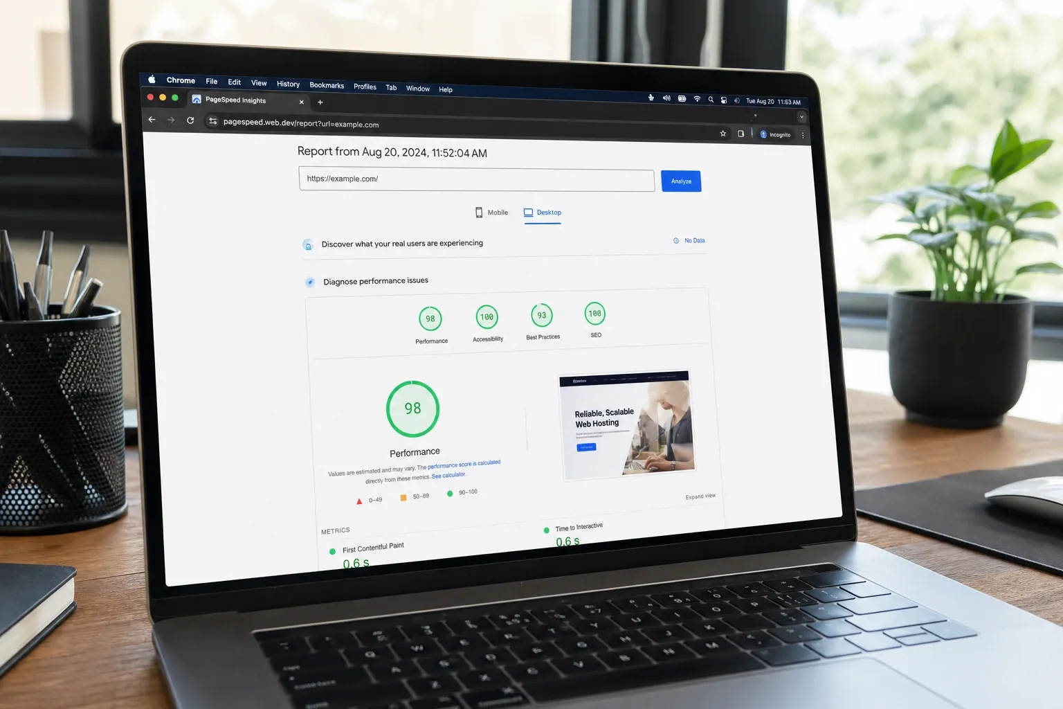
PageSpeed Insights
PageSpeed Insights runs Lighthouse against real-world conditions and reports both lab data (simulated) and field data (CrUX). Field data shows your actual LCP at the 75th percentile for real users — this is the number that affects your search rankings. Before-and-after comparisons after an image optimization effort typically show LCP improvement within a few days as field data updates.
WebPageTest Visual Comparison
WebPageTest lets you run A/B tests from different geographic locations and connection speeds. The filmstrip view shows exactly when your LCP image finishes loading relative to the rest of the page. The waterfall chart shows download time per image, making it easy to identify which images are most impactful to optimize next.
10-Point Image Optimization Checklist
- Choose the right format: Photos → WebP or AVIF, vector → SVG, UI/screenshots → PNG.
- Compress before upload using a client-side tool to control format, quality, and dimensions.
- Specify width and height on every
<img>element to prevent CLS. - Use srcset and sizes to serve appropriately sized images to every device.
- Implement picture element for AVIF/WebP with JPEG fallback.
- Add loading="lazy" to all below-the-fold images.
- Never lazy-load the hero or LCP image — add
fetchpriority="high"instead. - Preload the LCP image with
<link rel="preload" as="image">in the document head for critical hero images. - Set long cache headers with content-hashed filenames so images are cached indefinitely.
- Measure with Lighthouse and PageSpeed Insights before and after to verify improvement.
Putting It All Together
Image optimization is one of the highest return-on-investment performance improvements available to web developers. A typical optimization pass — converting to WebP, serving responsive sizes, lazy-loading below-the-fold images, and adding width/height attributes — can improve LCP by 1–2 seconds and eliminate most CLS on image-heavy pages. These improvements compound across both user experience and search ranking.
Start by running a Lighthouse audit to identify your highest-impact images, then compress them using our free image compressor before re-uploading. No account required, no file size limits, and your images never leave your browser.