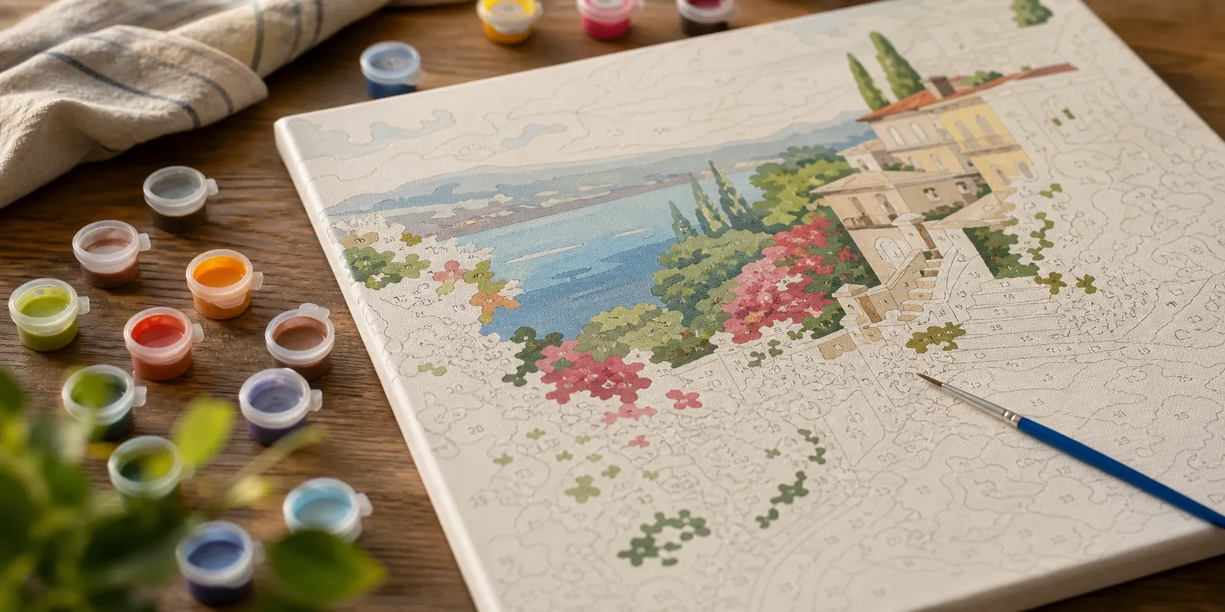
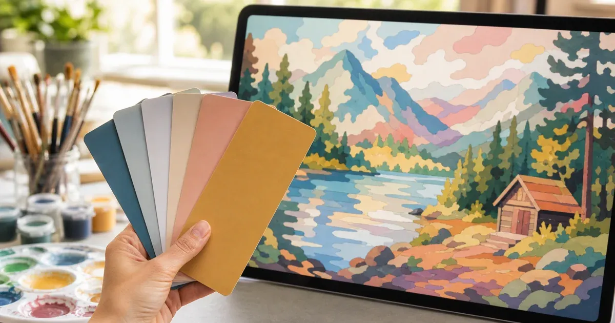
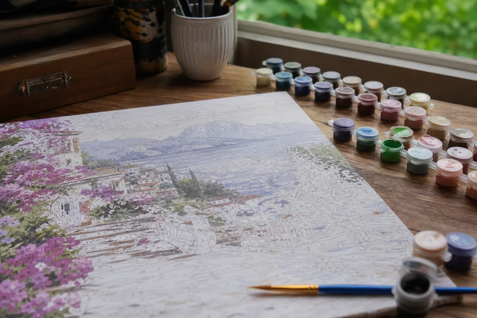
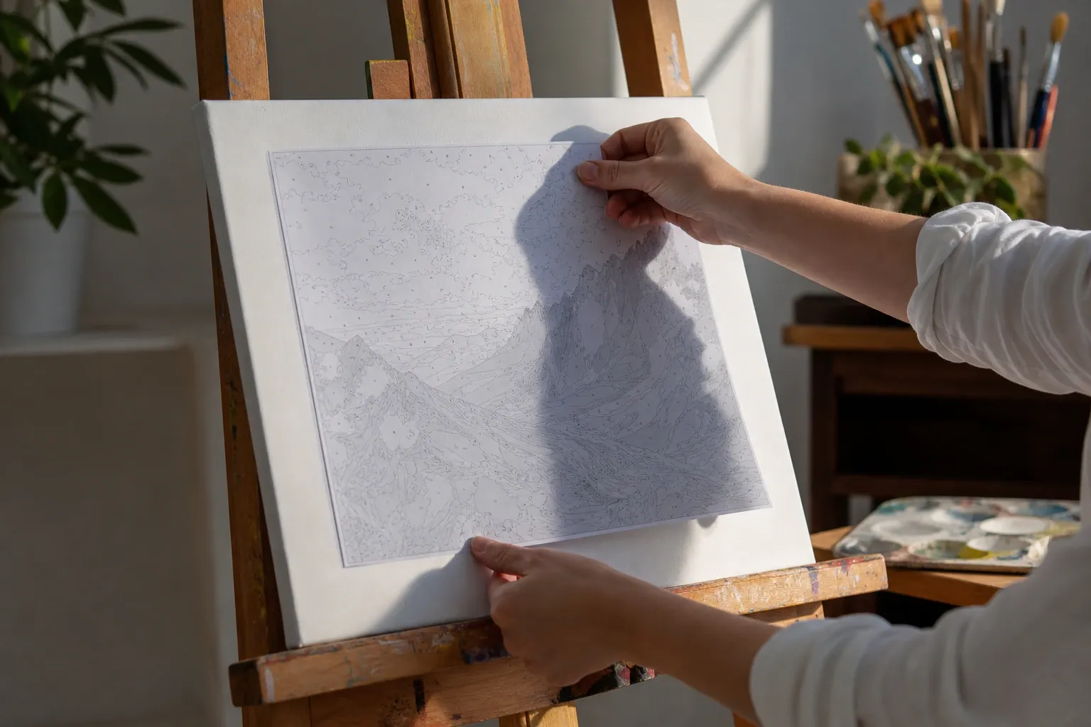
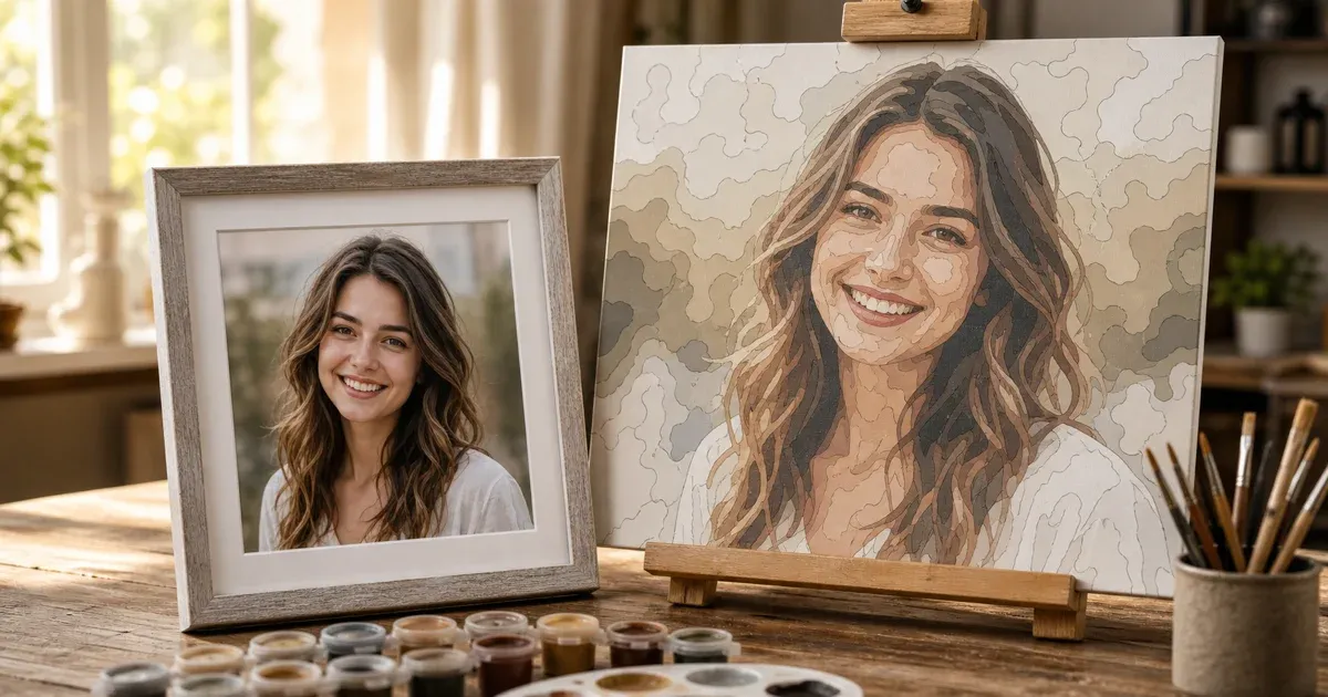
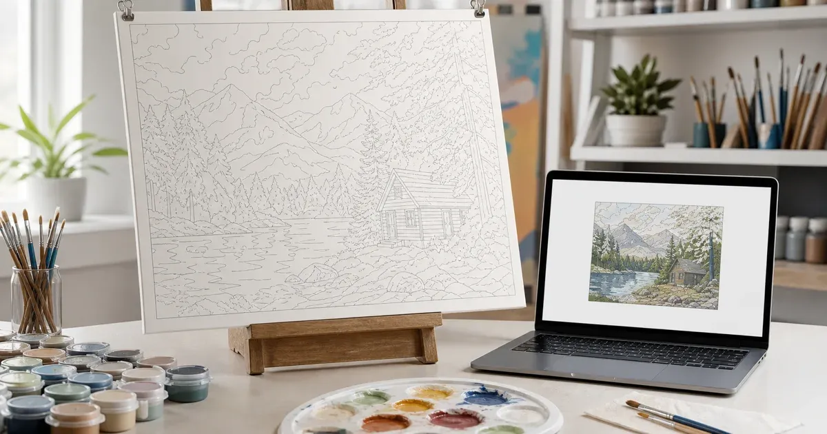
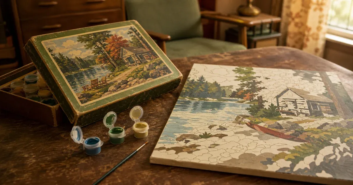
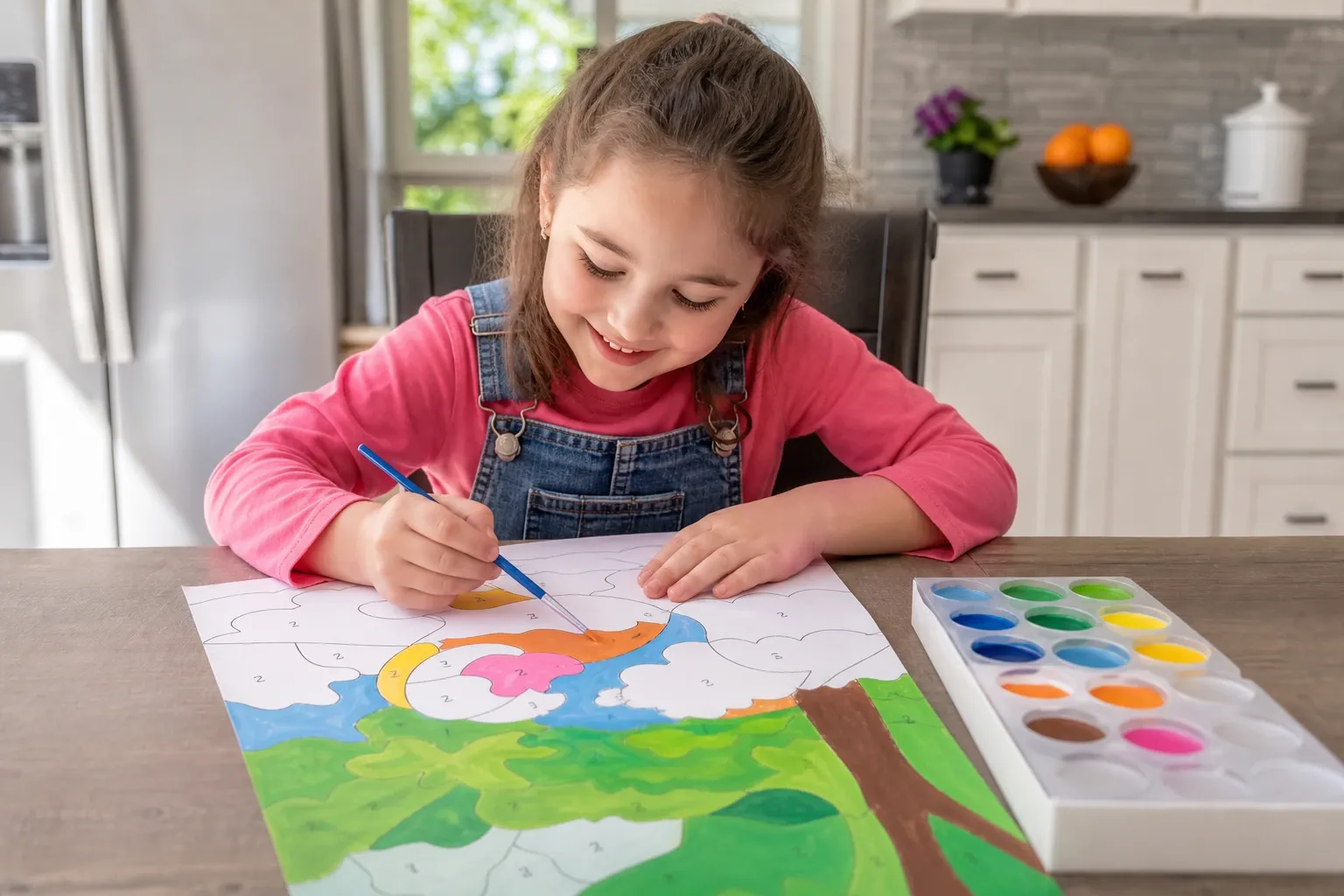
A paint-by-numbers template turns a continuous-tone photograph into flat color regions, each labeled with a number that maps to a paint: a limited palette, areas big enough to paint, a legible number on every one. Here is what this tool actually does at each stage.
K-Means in CIELAB, Seeded With K-Means++
K-means partitions the pixels into k groups, each joining the cluster whose center is nearest; that center is the mean of its members, which is why every palette color is the average of the pixels it stands for. Seeding uses k-means++ — each new seed picked with probability proportional to its squared distance from those already chosen — so two clusters do not chase one color while a whole hue goes unrepresented. All of it runs in CIELAB, where distance approximates perceived difference.
Keeping Palette Colors Apart — and What It Costs
K-means alone still spends slots where the pixels are, not where the interest is: skin dominates a portrait, so a dozen entries can land in browns while a lip red never wins one. The tool therefore enforces a minimum perceptual separation, using the same threshold as the “Merge similar colors” control. Over three rounds it looks for the closest pair of centroids nearer than that threshold, and for a bin of the image's own colors further than the threshold from every centroid. When both exist, the pair collapses into its area-weighted mean — the color you would get mixing the two paints in proportion to the canvas each covers — and the freed centroid is re-seeded on the best-scoring candidate bin, scored by area times distance to its nearest centroid.
This is a deliberate trade, not a universal improvement. On a photograph that really is all one hue, or whose palette is already well spread, one side of the trade is unavailable and the centroids are left exactly as k-means produced them. When it does fire, you gain a color that was absent and pay in overall fidelity: measured on three real portraits, one gained a missing blue and a second lip red and improved overall, one improved slightly, and one made its lips paintable while its mean color error got worse. Set the control to Off to keep the palette k-means measured.
From Colors to Paintable Regions
Once every pixel carries a palette number the image splits into connected regions of the same number, and two passes clean that up. The first asks whether two neighbours are really one color to someone holding a brush: it walks adjacent pairs in order of how close they are in CIELAB, merges any pair within the threshold into their area-weighted blend, and repeats — merging changes the survivor's color, which can bring a third neighbour into range. That is what stops a face breaking into a mosaic of slivers, and it runs first so everything downstream sees fewer, less thin regions. The second pass absorbs any region left with no paintable interior into its closest neighbour in color.
Outlines: Boundary Edges, Then Curves
Outlines here are not produced by edge detection. Every unit edge of the pixel lattice where the two adjacent regions differ is collected as a boundary edge, and those edges are stitched into closed rings — which is why neighbours share one gap-free line rather than two nearly-coincident ones. Each shared run of boundary is simplified once with the Ramer–Douglas–Peucker algorithm, at the tolerance your “Smooth edges” setting picks, then shared verbatim by both regions bordering it. That still leaves the zig-zag a pixel grid makes of a curve, so a final pass judges each remaining vertex by how sharply the outline turns across a short window either side of it: more than 30° is a real corner, kept exactly; less is tolerance residue on a smooth edge, rounded into a quadratic Bézier curve anchored on the midpoints of its neighbouring edges. That is what makes a shoulder read as a drawn line, not a staircase.
Placing the Numbers, and Why Some Need a Leader Line
Each number has to sit clearly inside its region, even for a curved or L-shaped area whose geometric center falls outside it. The tool computes a distance transform per region and places the number at the "pole of inaccessibility" — the interior point farthest from any border. The distance there is the region's inscribed radius. Whether a number fits is only meaningful relative to the size you print: a digit of your chosen millimetre height occupies (mm ÷ 25.4) × DPI pixels on the sheet, and dividing by the output pixels per segmentation pixel converts that into the radius's own units. Any region below half that gets a leader line — sixteen directions are sampled from its label point, the one leaving the region fastest wins, and the number sits just beyond the exit with a line drawn back in. Because the requirement is anchored to a physical millimetre, the same photograph genuinely needs more leader lines on A5 than on A3.
When a Photo Is Too Much Work
All of this runs in your browser, and a segmentation ceiling protects the tab from a run that would never finish. High-detail photographs — sand, fur, foliage — used to cross it; the color-merging stage is where such a run spends nearly all its time, and it is now dramatically cheaper, so a photo that took over a minute in Firefox and gave up finishes in a few seconds. The ceiling has not gone away, because some photograph will always be too much work. What changed is that hitting it now names the two settings that measurably reduce the work — fewer colors, and a higher “Merge similar colors” value — instead of leaving an empty panel.
Related tools on the same colour engine
To see the exact palette this generator would pick — in HEX, RGB and HSL, with each colour's share of the picture — run the photo through the colour palette generator first; it is handy for matching paints or printing a swatch card next to the canvas. And if what you actually want is the filled, coloured vector of a logo or flat illustration rather than a numbered template, the image to SVG converter shares this tool's region tracing but keeps the fills.