The Problem Dithering Solves
Imagine you want to draw a smooth sunset — a sky fading from deep orange down to pale yellow — but your palette contains only two colors: one orange and one yellow. With just those two flat blocks, the sky would show a single hard line where orange meets yellow, nothing like the gentle gradient you can see. This is the fundamental limitation of any small palette: it has no "in-between" colors to represent the shades that fall between the ones it stores.
Dithering is the classic solution. Instead of inventing a new color, it arranges the colors you already have in a fine pattern so that, viewed from a normal distance, your eye optically blends them into the missing shade. A region that is halfway between orange and yellow becomes a fine mix of orange and yellow dots, and from arm's length it reads as the intermediate tone you wanted. Dithering is how four-color Game Boy games rendered convincing shadows and how early PCs displayed photographs — and it is central to good pixel art today. If you want to experiment with it hands-on, our Pixel Art Generator offers both methods described below.
Why a Small Palette Can't Show Gradients
To understand dithering you first have to understand quantization — the act of forcing every pixel to the nearest available palette color. When you reduce a full-color photo to, say, eight colors, each original pixel is rounded to whichever of the eight is closest. That rounding introduces an error: the difference between the color the pixel wanted to be and the color it was forced to become. In a smooth gradient, thousands of adjacent pixels all get rounded to the same palette color until the gradient crosses a threshold and they all suddenly snap to the next one. The result is banding: visible stripes where the flat color abruptly changes. Dithering works by taking that rounding error and doing something clever with it instead of throwing it away.
Method 1: Floyd–Steinberg (Error Diffusion)
The Floyd–Steinberg algorithm, published by Robert Floyd and Louis Steinberg in 1976, is the most famous error-diffusion method. Its idea is elegant: when a pixel is rounded to the nearest palette color, the error is not discarded — it is pushed onto the neighboring pixels that have not been processed yet. Those neighbors are then nudged slightly toward the color the original pixel could not fully express, so when they in turn get rounded, they are more likely to pick up the missing shade.
Concretely, the algorithm scans the image left to right, top to bottom. For each pixel it finds the nearest palette color, computes the error, and distributes that error to four not-yet-visited neighbors in fixed proportions — the largest share to the pixel immediately to the right, and smaller shares to the three pixels below. The exact weights (7/16 to the right, and 3/16, 5/16, 1/16 across the row below) are what give the method its characteristic organic, scattered texture. Because the error keeps flowing forward, the overall average color of any region matches the original photo very closely, even though every individual pixel is one of your few palette colors.
What It Looks Like
Floyd–Steinberg produces a soft, almost photographic grain. There is no obvious repeating pattern; the dots appear naturally scattered, which makes gradients and skin tones look smooth and lifelike. This is usually the best choice when you want the result to still read as a real scene — landscapes, portraits, and anything with subtle shading.
Its Trade-offs
Because each pixel depends on the ones before it, error diffusion is inherently sequential and can introduce faint "worm" or "snake" artifacts in large flat areas. In animation, its frame-to-frame instability can cause shimmering, since a tiny change in one pixel ripples across the whole row. And on very small sprites, the scattered dots can read as noise around fine details like eyes, so it is worth using a lighter strength on faces.
The Error-Diffusion Family
Floyd–Steinberg is the best-known member of a larger family of error-diffusion filters. They all share the same idea — round a pixel, then spread the leftover error to unprocessed neighbors — and differ only in the kernel: which neighbors receive error and in what proportion. Wider kernels spread the error over more pixels, which smooths the result but costs more computation. Our Pixel Art Generator implements the Floyd–Steinberg kernel for error diffusion; the others below are described so you can recognize their signatures in art made with other tools, not because this tool ships them.
The Floyd–Steinberg kernel spreads the error to four neighbors, dividing by 16. The X marks the current pixel; numbers are the fraction of the error each neighbor receives:
| Filter | Row | Weights (denominator) |
|---|---|---|
| Floyd–Steinberg (÷16) | current | — X 7 |
| below | 3 5 1 |
Atkinson, developed by Bill Atkinson for the early Apple Macintosh, deliberately diffuses only six eighths of the error (each of six neighbors gets 1/8, and 2/8 is simply discarded). Throwing away part of the error raises contrast and keeps highlights and shadows crisp — the classic high-contrast "Mac" look — at the cost of losing some tonal detail in flat mid-tones:
| Filter | Row | Weights (each ÷8) |
|---|---|---|
| Atkinson (÷8, only 6/8 diffused) | current | — X 1 1 |
| below | 1 1 1 | |
| 2 below | — 1 — |
Jarvis, Judice & Ninke (JJN, 1976) and the closely related Stucki filter use much wider kernels that push error two rows down and two columns out, dividing by 48 and 42 respectively. Spreading the error across twelve neighbors produces smoother gradients with fewer worm artifacts than Floyd–Steinberg, but the extra reach makes them noticeably slower and can blur fine detail. The JJN kernel:
| Filter | Row | Weights (÷48) |
|---|---|---|
| Jarvis–Judice–Ninke (÷48) | current | — — X 7 5 |
| below | 3 5 7 5 3 | |
| 2 below | 1 3 5 3 1 |
The practical takeaway: Floyd–Steinberg sits at a sweet spot of quality versus speed, which is why it is the default in most tools, including this one. The wider kernels are worth knowing about because you will see their smoother, softer texture in retro art made elsewhere.
Method 2: Ordered (Bayer) Dithering
Ordered dithering takes a completely different approach. Instead of propagating error between pixels, it compares each pixel against a fixed threshold map — a small matrix of values tiled across the whole image — and uses that comparison to decide which way to round. The definitive threshold map is the Bayer matrix, described by Bryce Bayer of Kodak in his 1973 paper "An Optimum Method for Two-Level Rendition of Continuous-Tone Pictures." Bayer's matrix is special because its values are arranged to be spread as evenly as possible, and it can be recursively expanded to 4×4, 8×8, and larger while keeping that even distribution.
In practice, a small offset from the Bayer matrix is added to each pixel's value before it is snapped to the nearest palette color. Pixels at "high threshold" positions in the tile are more likely to round up, and pixels at "low threshold" positions to round down, so a region of a single in-between color becomes a regular, patterned mix of the two nearest palette colors.
What It Looks Like
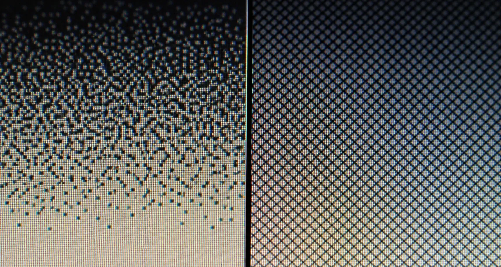
Ordered dithering has a distinctive, deliberate cross-hatch or halftone texture — the regular grid of dots you recognize from 8-bit games, early PC graphics, and newspaper printing. Because the pattern is fixed and does not depend on neighboring pixels, it is stable and repeatable: the same input always dithers to the same output, with no worm artifacts and no frame-to-frame shimmer in animation.
Its Trade-offs
The very regularity that makes ordered dithering stable also makes its pattern more visible. It looks less like a real photograph and more like a stylized, retro rendering — which is often exactly what you want, but not if you are after photographic realism. On the plus side, its independence from neighbors makes it trivially parallelizable and perfectly deterministic.
Bayer Matrix Sizes: 2×2 vs 4×4 vs 8×8
The Bayer matrix comes in recursively doubling sizes, and the size you pick trades pattern visibility against tonal resolution. A matrix with more cells offers more distinct threshold levels, so it can represent more intermediate shades between two palette colors — but its tiled pattern is larger and, at some sizes, more noticeable.
- 2×2 — only four threshold levels. The pattern is tiny and almost invisible, but it can express very few intermediate tones, so gradients look coarse and blocky.
- 4×4 — sixteen threshold levels. A strong balance: enough tonal steps to shade a gradient believably, with a pattern small enough to stay subtle at typical pixel-art scales. This is the matrix our Pixel Art Generator uses for ordered dithering.
- 8×8 — sixty-four threshold levels. The smoothest tonal range and a common default in general-purpose dithering, at the cost of a larger repeating tile that becomes visible in big flat areas.
There is no universally correct size; 4×4 and 8×8 are the two most common choices because they land where the pattern is acceptable and the tonal range is useful. For the small grids typical of pixel art, 4×4 keeps the cross-hatch tight and readable, which is why this tool standardizes on it.
One modern alternative is worth naming: blue-noise dithering replaces the regular Bayer grid with a precomputed noise texture whose energy is concentrated in high frequencies, so the dots scatter evenly without any visible repeating pattern and without the sequential worms of error diffusion. It generally looks cleaner than ordered dithering, but it needs a precomputed noise table and is a different algorithm — this tool does not use blue noise; it offers Floyd–Steinberg and 4×4 ordered Bayer. Mentioning it here just helps you place what you are seeing when other tools offer a "blue noise" option.
Head to Head: Which Should You Use?
Neither method is "better" — they serve different goals:
- Choose Floyd–Steinberg when you want smooth, natural-looking results: photographs, portraits, gradients, and skies where you want the palette reduction to be as invisible as possible.
- Choose Ordered (Bayer) when you want an intentionally retro, patterned look; when you need a stable result for animation; or when the visible cross-hatch is part of the aesthetic you are going for.
- Choose no dithering for logos, icons, and flat graphics, where clean solid blocks of color read best and any dithering would only add unwanted texture.
A good habit is to convert your image once with each setting and compare. Because both methods keep the output strictly inside your chosen palette, you can freely swap between them without changing your colors — only the texture changes.
Dithering Strength
Beyond choosing a method, you can usually control the strength of the effect. At full strength the error (or threshold offset) is applied completely, giving the most pronounced pattern and the smoothest apparent gradients. Dialing it down applies only a fraction, producing a subtler blend that sits between "flat quantization" and "full dithering." Lower strengths are useful on faces and small sprites, where a full-strength scatter can look busy; higher strengths help large gradients like skies. As with palette and grid size, adjust it in small steps and watch the preview.
Which Dithering for Which Job
Method choice is easier when you tie it to the specific job and, crucially, to your palette size — because dithering matters far more with a small palette than a large one. With 256 colors, quantization error is already tiny and dithering is a light polish; with 8 to 16 colors, the error is large and dithering does the heavy lifting of faking the missing shades. A few concrete cases:
- Photographic gradients (skies, skin, sunsets) at 8–16 colors: Floyd–Steinberg. Its scattered grain hides banding where the palette is weakest.
- Retro game sprites and tile art: ordered Bayer. The regular cross-hatch is part of the aesthetic, and its frame-to-frame stability keeps animations from shimmering.
- Logos, icons, and flat UI graphics: no dithering. Clean solid blocks read best; any pattern only muddies the edges.
- Large palette (128–256 colors): either method, low strength, or none — the eye can barely tell, so pick for texture, not necessity.
- Faces and tiny details: whichever method, lower strength, so the pattern does not read as noise around eyes and mouths.
The single best habit is to render the same image with each method and compare at 100% zoom, then again zoomed out. Because both methods keep every output pixel strictly inside your chosen palette, switching between them never changes your colors — only the texture — so the comparison is quick and safe.
Banding, and Why Dithering Fixes It
To see exactly what dithering buys you, picture a horizontal gradient from black on the left to white on the right, reduced to just four grays. Without dithering, quantization snaps every pixel to the nearest of the four grays, so the gradient becomes four flat vertical stripes with three hard seams between them — the textbook look of banding. Your eye is drawn straight to those seams because real scenes almost never contain such abrupt tonal jumps.
Turn dithering on and those seams dissolve. Near each boundary, the two neighboring grays are interleaved in a fine pattern — mostly the darker gray just before the seam, shifting to mostly the lighter gray just after — so the transition reads as gradual instead of stepped. Floyd–Steinberg scatters that transition organically; ordered Bayer renders it as a regular cross-hatch; both replace one visible seam with a soft blended zone. The palette never grew — there are still only four grays — but by mixing them spatially, dithering manufactures the illusion of the dozens of intermediate grays the palette cannot store. That is the entire trick, and it is why even a tiny palette can render a convincing gradient.
A Brief History
Dithering predates pixel art hobbyists by decades. Bayer's ordered method came out of 1970s research into rendering continuous-tone images on two-level (black-and-white) devices, and error-diffusion methods like Floyd–Steinberg followed shortly after. These techniques powered everything from early laser printers and fax machines to the limited displays of home computers and handheld consoles. What began as an engineering necessity — squeezing photographs onto hardware that could only show a few colors — became an aesthetic in its own right, and that is why deliberately dithered pixel art still feels so evocative today.
Conclusion
Dithering is the art of lying convincingly about color: mixing the few tones you have to suggest the many you do not. Floyd–Steinberg diffuses rounding error to neighboring pixels for a smooth, organic blend, while ordered Bayer dithering uses a fixed threshold matrix for a stable, patterned retro look. Understanding the difference lets you pick the right texture for each image instead of accepting whatever a filter gives you. To see both in action on your own photos, try our Pixel Art Generator — and if you are new to the whole process, start with How to Turn a Photo into Pixel Art. The same palette-reduction and dithering ideas power fabric crafts too: see how they translate into a photo-to-cross-stitch pattern, where a limited thread palette faces exactly the banding problem dithering solves.