Introduction: Two Steps, Done Well
Turning a photograph into convincing pixel art looks like it should be a one-click filter, but the good results come from understanding what is actually happening. A photo is a fine grid of millions of subtly different colors. Pixel art is the opposite: a small grid of large, flat blocks drawn from a tiny, deliberate palette. Converting one into the other is really two separate jobs — reducing the resolution and reducing the colors — and the quality of your result depends on doing each one thoughtfully rather than mashing them together.
This guide walks through the whole process, control by control, so you can go from a raw photo to a crisp, shareable sprite and understand every choice along the way. If you want to follow along on your own images, our free Pixel Art Generator runs the entire pipeline described here directly in your browser — nothing is uploaded to a server.
Step 1: Start with the Right Photo
The single biggest factor in a good conversion is the input. Pixel art rewards a strong, simple composition, because you are throwing away almost all of the detail and keeping only what reads at a glance. The best candidates share a few traits:
- A clear subject: one face, a pet, a single object, a bold landmark. Busy scenes full of small overlapping details turn to mush when reduced to a coarse grid.
- Good contrast: a subject that stands out from its background. Low-contrast photos where everything is a similar mid-tone lose their shapes entirely.
- A simple background: a plain wall, sky, or blurred backdrop lets your limited colors go to the subject instead of being wasted on clutter.
Before converting, crop tight so the subject fills the frame. Every pixel is precious at a 64×64 grid, and a subject that occupies the whole image will always read better than the same subject lost in a wide shot.
Step 2: Choose a Grid Size
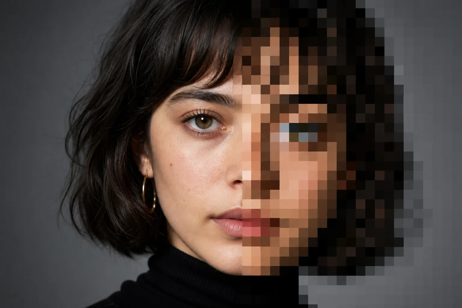
The grid size sets how many blocks tall and wide your pixel art will be. This is the resolution knob, and it drives the entire feel of the result. Smaller grids (32–48 pixels) give a chunky, iconic look reminiscent of early handheld sprites; larger grids (96–128 pixels) preserve more of the subject's detail and are more forgiving of complex images.
Under the hood, a good converter does not simply pick one source pixel per block. Instead it averages every source pixel that falls inside each block — a technique called area averaging. This keeps each block's color representative of the region it covers and avoids the harsh noise you get from naive nearest-pixel sampling. The averaging is also alpha-weighted, so transparent regions do not drag your colors toward black.
A reliable starting point is 64 pixels. It is small enough to look unmistakably like pixel art and large enough to keep a recognizable subject. Convert once at 64, look at the result, and only then decide whether you want it chunkier (go smaller) or more detailed (go larger).
Step 3: Pick a Palette
With the grid in place, each block still holds a full-color value that must be mapped to a small palette. This is where pixel art gets its character, and you have three broad choices.
Auto: Colors Learned from Your Photo
In Auto mode the palette is derived from the photo itself using k-means clustering — an algorithm that groups the image's colors into a handful of representative clusters, each defined by its average color. Crucially, this clustering happens in the CIELAB color space rather than raw RGB. CIELAB was designed so that the straight-line distance between two colors approximates how different they look to a human eye, so "nearest color" genuinely means nearest to your perception. The practical effect is that skin tones stay lifelike, skies stay smooth, and the dominant colors of the scene survive the reduction. Auto is the best default for portraits and photographs where you want the result to still resemble the original.
Retro: Snap to a Classic Console Palette
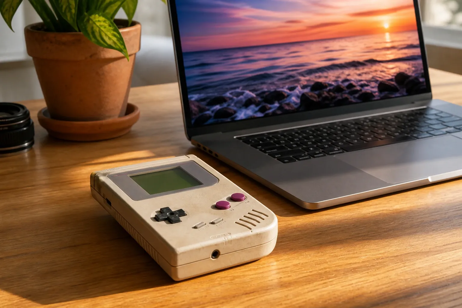
Retro mode maps your blocks to a fixed, historically accurate palette. The Game Boy, for instance, had a 160×144 screen that could only display four shades of green, and snapping a photo to those four values gives an instantly nostalgic, monochrome-handheld look. PICO-8, a modern "fantasy console," defines a deliberately punchy 16-color palette where every pixel is stored as a 4-bit value; it is saturated and graphic rather than photographic. Other options like CGA and 1-bit push the constraint even further. Retro palettes are a fast way to get a specific era's aesthetic without hand-picking colors.
Custom: Your Own Colors
Custom mode lets you supply your own hex colors — useful when you are matching a brand, a game project, or an existing tileset. You can paste a large list of colors and ask the tool to reduce it to the number you actually want; it snaps the image to those exact values so the output is guaranteed to use only colors you approved.
Step 4: Decide on Dithering
Here is the counter-intuitive part: a tiny palette cannot show a smooth gradient — a four-color Game Boy palette has no "in-between" green for a fading sky. Dithering is the classic trick that fakes those missing shades by mixing the colors you do have in a fine pattern that the eye blends into an intermediate tone. There are two genuine methods, and they look distinctly different:
- Floyd–Steinberg (error diffusion, published by Robert Floyd and Louis Steinberg in 1976) snaps each pixel to the nearest palette color and then pushes the leftover error onto neighboring pixels, producing an organic, almost photographic blend.
- Ordered (Bayer) dithering, based on Bryce Bayer's 1973 method, adds a fixed threshold pattern before snapping, producing the regular cross-hatch texture associated with 8-bit games and early PCs.
Both keep the output strictly inside your palette. For a deeper comparison of when to use each — and why they look so different — see our companion guide, Dithering Explained: Floyd–Steinberg vs Ordered. As a rule of thumb: dithering shines on landscapes and skies, should be used lightly on faces to avoid noise around fine features, and is often best turned off entirely for logos and flat graphics.
Step 5: Tune Vividness and Preview
A light vividness boost before quantization can help a flat photo separate into cleaner color groups, giving the palette more distinct clusters to work with. It is easy to overdo, though, so nudge it in small steps and watch the preview. Nothing here is random — the color clustering uses a fixed seed and both dithering methods are deterministic — so within one browser the same photo and settings always produce exactly the same result, which makes it easy to compare two settings and know that only the setting changed. Keep the comparison inside one browser, though: your photo is decoded and scaled by the browser before the palette is computed, and different browsers resample slightly differently, which can shift the chosen colors a little.
Step 6: Export at the Right Scale
When you are happy with the preview, you have two useful ways to export, both as standard PNG files:
- Native grid (1×): a tiny, exact PNG where one file pixel equals one art block. This is ideal as a game sprite, a favicon, or the source for further hand-editing in a dedicated pixel editor.
- Integer upscale (4×, 8×): the same art enlarged with nearest-neighbor scaling, which keeps every block a hard-edged square instead of blurring it. Use this for profile avatars, chat stickers, wallpapers, or print pieces.
The reason upscaled pixel art stays crisp is that nearest-neighbor scaling never interpolates — it simply repeats each block. That is also why you should avoid resizing pixel art in a normal photo editor, which will smooth it and destroy the effect. Always scale by whole-number multiples.
Troubleshooting: When It Looks Muddy
If your first attempt looks murky or unrecognizable, work through these adjustments one at a time:
- Increase the grid size for more detail if the subject has become unreadable.
- Reduce the color count for a bolder, more graphic look if the image feels flat and noisy — fewer colors often read better, because they force shapes to gain clean edges.
- Crop tighter so the subject fills more of the frame.
- Ease off the dithering if faces or fine details are getting speckled.
Changing one control at a time makes it obvious which adjustment helped, and it usually takes only two or three tries to land on a version you like.
Why Do This in the Browser?
Because your photo never needs to leave your device. The entire conversion — downsampling, color quantization, and dithering — runs locally using standard web technologies, so personal photos and portraits stay private and the tool even works offline once the page has loaded. There is no account, no watermark, and no upload.
Conclusion
Good pixel art is not about a magic filter; it is about two deliberate reductions done well: shrinking the resolution to a real block grid and mapping the colors to a small, meaningful palette, with dithering to fake the shades in between. Start with a strong, simple photo, begin at a 64-pixel grid with an Auto palette and no dithering, and adjust one control at a time. When you are ready, open the Pixel Art Generator and turn one of your own photos into a crisp, retro sprite — right in your browser.