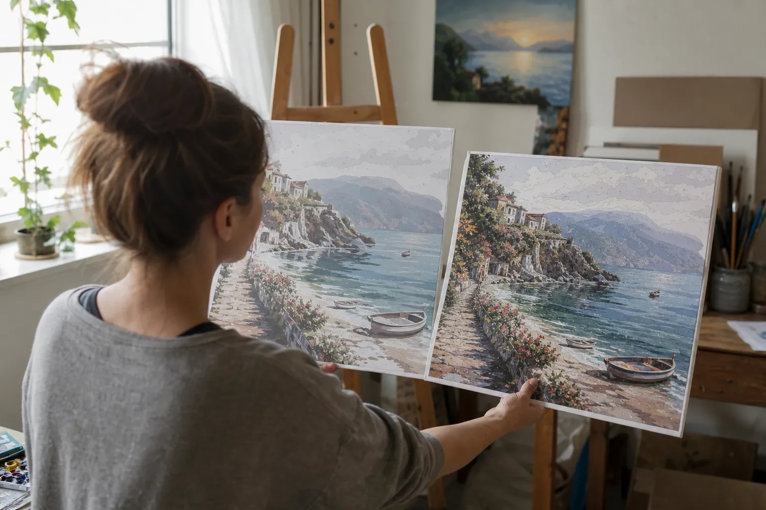
The Question Every Custom Paint by Numbers Starts With
When you turn a photo into a paint-by-numbers template, the single most important decision is how many colors to use. It sounds like "more is better" — more colors, more detail, a more faithful reproduction. In practice, the relationship is not linear, and past a certain point adding colors makes the template worse: muddier, busier, and harder to paint. This guide explains how to pick the right count for your image, why the sweet spot is usually lower than people expect, and how to avoid the classic mistakes. You can follow along with our free Paint by Numbers Generator, which lets you switch color counts instantly and compare.
Why More Colors Is Not Always Better
A paint-by-numbers generator uses color quantization to reduce a photo to a fixed palette (see our explainer on how paint-by-numbers generators work for the algorithm behind it). The tool clusters the image's colors and picks a representative for each group. When you request more colors, the tool subdivides the existing groups into finer distinctions.
Here is the catch: on most photographs, especially ones with muted or textured areas, those finer distinctions are between colors that look nearly identical. A photo dominated by a beige wall, brown foliage, and green grass does not contain 40 clearly different colors — it contains maybe six or eight obvious colors and a lot of subtle variation. Ask for 40 colors and the tool spends most of the extra budget on near-duplicate browns and grays. The result has more paints but less clarity, because neighboring regions differ by shades you can barely tell apart.
The Two Symptoms of Too Many Colors
- Muddiness: the palette fills with similar tones, so the finished piece looks washed out instead of crisp.
- Fragmentation: textured areas (leaves, brick, gravel, hair) shatter into dozens of tiny regions that are impractical to paint and clutter the template with unreadable numbers.
By contrast, a low color count forces the tool to choose colors that are genuinely distinct. That is why a four-color version of a photo often reads as more detailed and recognizable than a sixty-color version — the eye latches onto clear shapes rather than a noisy mosaic.
Recommended Color Counts by Subject
There is no universal answer, but these ranges are a reliable starting point:
- 2–4 colors — bold and graphic. Great for logos, silhouettes, high-contrast portraits, and children's projects. Produces a poster-like result that is very fast to paint.
- 6–10 colors — the everyday sweet spot. Suits the majority of photographs: landscapes, pets, group photos, still lifes. Enough range for recognizable shading without overwhelming the painter.
- 12–18 colors — portraits and rich scenes. Skin tones, gradients in skies, and detailed backgrounds benefit from this range. Best on a larger canvas so the smaller regions stay paintable.
- 20+ colors — specialist use. Only worth it for high-detail, high-contrast source images printed large. On muted photos it usually adds noise, not detail.
Our generator offers a one-click "Recommended" count, but it is a fixed default rather than an analysis of your photo — see the section below on what it actually is. Treat it as a place to start and adjust from there.
How Canvas Size Changes the Answer
Color count and print size are linked. Each additional color creates more, smaller regions. On a postcard-sized print, 20 colors produces regions too small to hold a brush or a number. On a one-meter canvas, the same 20 colors are comfortable. As a rule of thumb: if you want a higher color count, print bigger. If you are stuck with a small print, drop the color count so the regions stay workable. The generator exports a scalable SVG precisely so you can print the same template at any size without the lines going blurry.
Make Higher Counts Work: Vividness and Smoothing
If you genuinely need more colors — say, for a detailed portrait — two controls make higher counts behave:
- Vividness boosts the separation between colors so the extra ones stay distinguishable instead of collapsing into muddy near-duplicates. It works by increasing chroma in a perceptual color space before the palette is chosen.
- Smoothing flattens photographic texture (grass, brick, foliage) before quantization, so a high color count captures real objects rather than exploding textured areas into speckle.
With both enabled, a 16-color portrait can look clean and detailed where a raw 16-color pass would look noisy. If your result still looks busy, reduce the count by a few and regenerate — it is almost always the faster path to a better template.
A Simple Workflow for Choosing
- Upload your photo and start with the recommended color count.
- Compare it against half that number and double that number. Three quick looks tell you where the sweet spot is.
- Turn on Vividness (Subtle) and Smooth edges to clean up the higher-count option.
- Switch to the numbered black-and-white view to check that every region is big enough to hold a number.
- Pick the lowest count that still captures the subject clearly — that is almost always the most paintable and satisfying result.
Common Mistakes to Avoid
- Maxing out the slider "to be safe." The maximum is for experimentation, not everyday use. On a normal photo it produces the muddiest, busiest output.
- Judging on screen at 100%. Zoom out or preview at print size. A template that looks detailed at full zoom can be an unpaintable mess at postcard scale.
- Ignoring the subject. A minimalist sunset wants few colors; a detailed portrait wants more. Let the image, not a fixed habit, decide.
- Forgetting the legend. More colors means more paints to buy or mix. Every color you add is real work at the easel.
A Worked Example: One Photo at Three Color Counts
Imagine a photo of two friends sitting on grass in front of a leafy garden wall. Here is roughly what happens as you change the count:
- At 4 colors, the tool is forced to pick the four most important, most distinct colors: a skin tone, a clothing color, the green of the grass and foliage, and the light gray of the wall. The result is bold and instantly readable — you know exactly what it is, and it paints in an afternoon.
- At 12 colors, you gain believable shading: a lighter and darker green, a couple of skin tones, shadows in the clothing, and variation in the wall. This is usually the most satisfying version — recognizable, nuanced, still very paintable.
- At 40 colors, most of the new colors go to the foliage and wall texture, splitting them into dozens of near-identical greens and grays. The people barely improve, while the background turns into a busy patchwork. It looks more complicated but not more beautiful, and it takes far longer to paint.
This pattern — big gains from 4 to 12, diminishing returns and rising noise beyond — holds for most photographs. It is exactly why the sweet spot sits in the middle, not at the maximum.
What the "Recommended" Count Actually Is
It is worth being blunt about this, because it is easy to assume otherwise: the "Recommended" chip in our generator is a fixed value of 24. It is the same number for a two-tone silhouette and for a crowded street scene. It is not computed from your image.
Why 24, and why fixed? Because 24 sits at both ends of a narrow useful band. Below it, portraits start collapsing — a face automatically reduced to eight colors loses whole regions of skin to a single flat patch. Above it, the underlying analysis that would pick a per-image number stops converging on a trustworthy answer, so publishing a computed figure would mean publishing a guess dressed up as a measurement. Offering one honest default is the smaller lie.
The practical consequence is that the recommendation carries no information about your photo, so the comparison workflow below is not optional polish — it is where the actual decision gets made. Try the default, then try roughly half of it, then judge with your eyes. For most everyday photographs the answer lands well below 24.
When You Actually Want a High Color Count
High counts are not useless — they are situational. They pay off when three things are true: the source image is genuinely high in contrast and detail (a sharp, well-lit portrait rather than a hazy snapshot), you are printing large (so the extra regions stay paintable), and you turn on Vividness so the additional colors remain distinct. A detailed portrait printed on a big canvas can carry 16 to 20 colors beautifully. The same 20 colors on a muted phone photo printed small is where "more" becomes "worse." Match the count to the material, not to the slider's maximum.
Quick Reference: Picking a Count in Ten Seconds
When you just want an answer, use this shorthand. For a bold, fast, kid-friendly result, choose 2 to 4 colors. For a normal photo you want to look good with reasonable effort, choose 6 to 10. For a detailed portrait or landscape you plan to print large and take your time with, choose 12 to 18. Only reach past 20 when the image is sharp and high-contrast, you are printing big, and you have Vividness switched on. And whatever you pick, glance at the numbered view before you print: if the regions look too small or the numbers do not fit, you have too many colors for that print size — drop a few and you will have a better, more paintable template.
Conclusion
The best number of colors for a paint-by-numbers template is the lowest count that still captures your subject clearly — usually 6 to 12 for everyday photos, more only for detailed portraits printed large. More colors is a tool for specific situations, not a default to reach for. Start from the recommended value, compare a couple of alternatives, lean on Vividness and Smoothing when you push higher, and choose for clarity rather than raw count. Try it now with the free Paint by Numbers Generator and see how quickly the sweet spot reveals itself.
References and Further Reading
- Color quantization — background on reducing an image to a fixed set of representative colors, the underlying process behind every color-count choice discussed here.
- k-means clustering — the clustering algorithm that subdivides an image's colors into groups as you increase the requested color count.
- CIELAB color space — the perceptual color space used when boosting Vividness (chroma) so extra colors stay distinguishable; it is designed to approximate perceived color difference, though not perfectly perceptually uniform.