Introduction: The Hidden Math Behind a Simple Craft
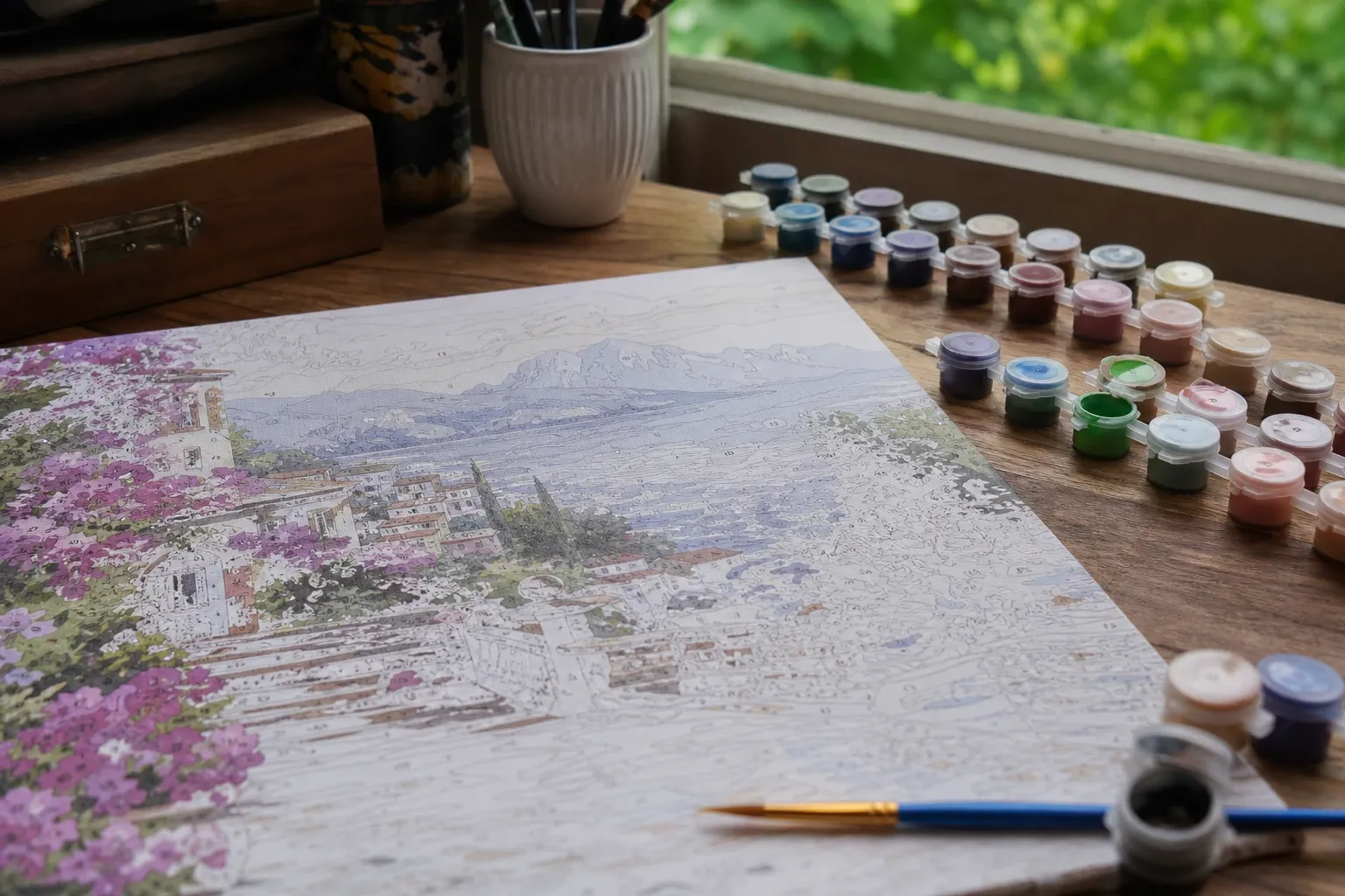
Paint by numbers looks almost trivial: a picture divided into outlined shapes, each stamped with a number that tells you which paint to use. But turning an arbitrary photograph — a sunset, a pet, a portrait with thousands of subtle colors — into that clean, paintable template is a genuinely interesting computer-vision problem. The generator has to decide which handful of colors best represent the whole image, draw the boundaries between them, and place a legible number inside every region. Do it badly and you get muddy colors, unpaintable specks, and numbers floating outside their shapes. Do it well and the result looks like a professionally produced kit.
This article explains, step by step, how a modern photo-to-paint-by-numbers tool works. If you want to follow along on your own images, our free Paint by Numbers Generator runs the entire pipeline described here directly in your browser, without uploading anything.
Step 1: Color Quantization — Choosing the Palette
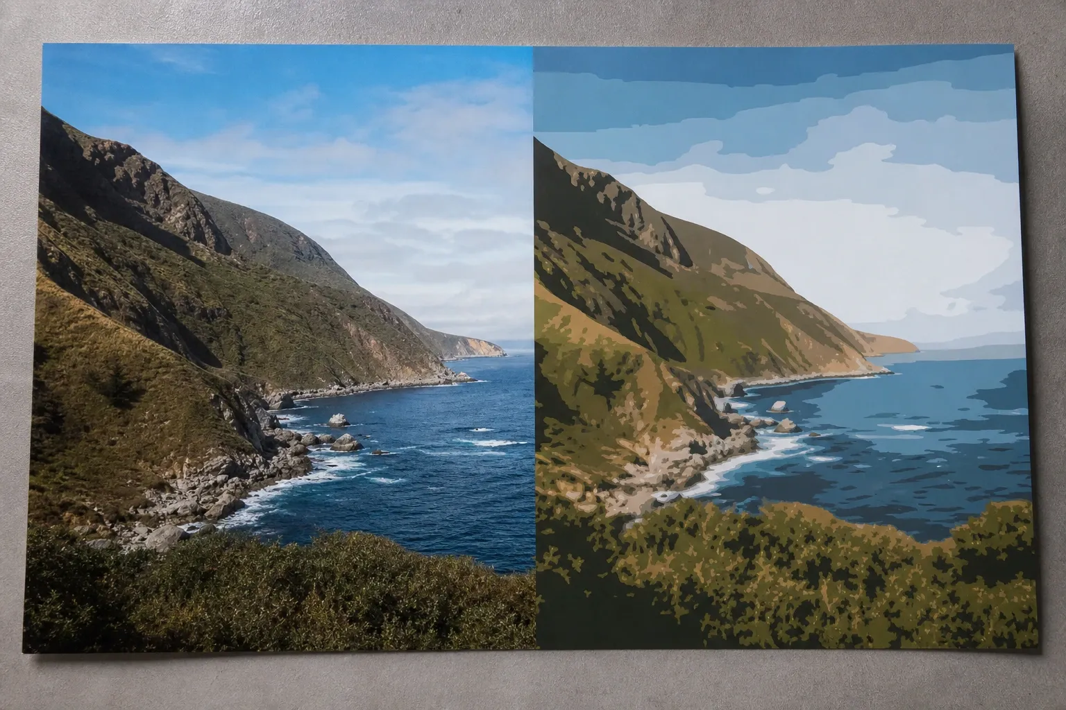
The heart of the problem is color quantization: reducing an image with potentially tens of thousands of distinct colors down to a small, fixed palette while keeping it recognizable. There are two broad ways to do this, and the difference in quality is dramatic.
The Naive Way: Posterization
The simplest method is posterization: round each color channel to a few fixed levels. If you allow four levels per channel, red can only be one of four values, and so on. Posterization is fast and predictable, but it produces harsh, arbitrary palettes because it never looks at which colors are actually in the picture. A photo dominated by warm skin tones and a photo dominated by blue sky get the same rigid grid of allowed colors, so both end up with unnatural results.
The Smart Way: Clustering
A far better approach is to examine the colors that genuinely appear and group them into representative clusters. This is exactly what k-means clustering does, and it is the algorithm behind virtually every high-quality quantizer, from the classic median-cut used in GIF encoders to the modern k-means pipelines used for paint-by-numbers.
Step 2: How K-Means Finds the Colors
K-means partitions all the pixels of an image into k groups. Each group is defined by a centroid — a single representative color — and every pixel is assigned to the centroid nearest to it in color space. The algorithm then repeats two steps until the palette stops changing:
- Assignment: put each pixel into the cluster whose centroid color is closest.
- Update: move each centroid to the average color of all the pixels now assigned to it.
This is why each color in a paint-by-numbers palette is literally the average of the pixels it represents. The centroid is, by definition, the single color that minimizes the total difference to its members — the mathematically optimal stand-in for that group. After a handful of iterations the centroids settle into a stable, representative palette.
Why Initialization Matters: K-Means++
K-means has one famous weakness: it is sensitive to where the clusters start. If two clusters happen to begin near the same color, they can spend the whole run fighting over the same region of the image while an entirely different hue goes unrepresented. The fix is a smarter seeding method called k-means++. Instead of picking starting colors at random, k-means++ chooses each new seed with probability proportional to how far it is from the seeds already picked. The seeds spread out across the image's color range, which produces a palette of colors that are as disjoint — as visually separated — as possible. For a paint-by-numbers template this is essential: you do not want three of your precious colors wasted on nearly identical shadows.
Step 3: Measuring Color the Way the Eye Does
There is a subtle trap in all of this: what does "nearest color" actually mean? The obvious answer is to measure distance in RGB — the red, green, and blue values stored for each pixel. But RGB distance does not match human perception. Two greens that are numerically close in RGB can look obviously different, while a numerically large jump in the blue channel might be barely noticeable. Clustering in RGB therefore tends to over-represent some regions of the spectrum and under-represent others.
The solution is to convert colors into a perceptual color space called CIELAB before clustering. CIELAB was designed so that the straight-line distance between two colors approximates how different they look to a human observer. When k-means runs in CIELAB, "the most distinct colors possible" genuinely means the most distinct to the eye, and the averaged centroids look natural rather than muddy. The final centroids are converted back to RGB for display and for matching real paints. This single change — clustering in CIELAB instead of RGB — is one of the biggest quality differences between a mediocre generator and a good one.
Step 4: From Colored Pixels to Paintable Regions
Once every pixel carries a palette number, the image is a mosaic of numbered pixels. The next job is to turn that into connected regions — contiguous blocks of the same color that a person can actually paint. A flood-fill or connected-components pass groups neighboring same-color pixels into regions.
Real photographs, though, are noisy. Along edges and in textured areas the quantized image is peppered with tiny specks — regions just one or two pixels across. Printed on a template, these would be impossible to paint and would fill the sheet with unreadable numbers. So the generator performs region cleanup: regions are processed smallest-first, and every region below a minimum area is absorbed by one of its neighbors. Which neighbor depends on a setting. With Blend by color on — the default — a speck merges into the neighbor whose palette color is closest to its own, with the length of the shared border used only to break ties between equally close neighbors. That is what keeps a small dark beard region merging into hair rather than into the surrounding skin, even when the skin wraps further around it. Switch Blend by color off and the rule becomes purely geometric: the speck joins whichever neighbor it shares the longest border with, regardless of color.
A second cleanup pass works on colors rather than shapes: neighboring regions whose palette colors are within a chosen perceptual distance of each other (a ΔE threshold you control with the Merge similar colors slider) are combined into one region. Fewer, larger regions are easier to paint; the cost is real, and worth stating plainly — subtle tonal nuance disappears, such as the shading inside a cheek or a beard.
Cleanup does not guarantee that every region can hold a printed digit. When a region is too narrow for its number, the generator draws a leader line instead: the number is printed in clear space outside the shape with a thin line pointing back into it. Whether a region needs one is judged in physical print units — the digit height in millimetres at the paper size and DPI you selected — not in image pixels, so switching from A3 to A5 can turn a comfortable number into one that needs a leader line without anything about the photo changing. There is also an explicit opt-in to merge those thin regions away instead, trading detail for numbers that all fit inside their shapes.
Step 5: Tracing the Outlines
With clean regions in hand, the tool draws the black outlines that define each area. The reliable way to do this is boundary-edge tracing: walk the grid of pixels and mark every tiny edge where two differently colored pixels meet, plus the outer edge of the image. Those unit edges are then stitched together into continuous paths. Because two neighboring regions share exactly the same boundary edges, each dividing line is drawn once and is perfectly watertight — no gaps, no doubled lines.
Two finishing steps turn that raw lattice into a drawable line. First, the path is simplified (Douglas–Peucker), so long runs collapse into single segments instead of recording every one-pixel step. Second, the surviving vertices are curve-fitted: a vertex that only exists because the simplifier split a shallow bend is replaced by a quadratic Bézier curve through the midpoints of its neighboring edges, while genuine corners past an angle threshold are kept sharp. The result is a flowing outline rather than the stair-stepped, rectilinear border a pixel lattice would otherwise give you. Because the curve is defined symmetrically from those midpoints, a border traced from either of the two regions it separates produces the identical curve, so the sheet stays watertight after smoothing.
Exporting these outlines as SVG (Scalable Vector Graphics) is what makes a good template printable at any size. In SVG the outlines are real vector paths and the numbers are real text, so you can print the same file as a postcard or blow it up to a meter-wide canvas with perfectly crisp edges. A raster format like PNG, by contrast, is locked to a fixed resolution and turns blocky when enlarged.
Step 6: Placing the Numbers
The last piece is deciding where each number goes. A naive choice — the geometric center (centroid) of the region — fails badly for curved, hollow, or L-shaped areas, where the center can land outside the region entirely, or right on a border. Good generators instead find the pole of inaccessibility: the interior point that is farthest from any edge of the region. This is computed with a distance transform, which measures every pixel's distance to the nearest boundary; the pixel with the maximum distance is the safest, most central place to print the number. The available space also sets the font size, so a large sky region gets a big bold number while a small highlight gets a modest one that still fits.
Choosing the Number of Colors
How many colors should a template use? It is a genuine trade-off between simplicity and fidelity:
- 2–4 colors: bold, poster-like, very easy to paint — great for children or graphic wall art.
- 6–10 colors: the sweet spot for most photos — clearly recognizable with a manageable number of paints.
- 12–18 colors: convincing shading for portraits and landscapes.
- 20 colors and up: gallery-level detail, but with many small regions that demand a large canvas and patience (pair high counts with a vividness boost so the extra colors stay distinct).
Our generator accepts any count from 2 to 255. The "Recommended" chip it offers on every photo is a fixed value of 24, not a per-image calculation: 24 is the count that keeps faces from collapsing into flat patches, and it is also where the underlying analysis stops giving reliable answers, so the tool offers it as a sane starting point rather than pretending to have measured your particular photo. Treat it as a default to move away from, not a verdict. Because switching color counts is instant in a browser-based tool, the practical advice is to try two or three values and compare.
One more thing shapes the palette. The quantizer enforces a minimum perceptual separation between palette entries: when two chosen colors land closer together than that threshold and the photo also holds a distinct color the palette missed — lips, eyes, a single bright object — the near-duplicate pair is collapsed and the freed slot is reallocated to the missing color, ranked by how much area it covers times how far it sits from anything already in the palette. This is a trade, not a free win. It rescues small, distinct features that a plain fidelity-driven palette would drop, at the cost of overall color accuracy on photos that genuinely are dominated by one hue. When the photo holds no such missing color, nothing is collapsed and every shade is kept.
Why Doing It in the Browser Matters
Every step above — decoding, CIELAB conversion, k-means clustering, region cleanup, outline tracing, and number placement — can run entirely on your own device using standard web technologies like the Canvas API and Web Workers. That means your photos never have to be uploaded to a server. For personal pictures, family portraits, or anything you would rather not hand to an unknown service, client-side processing is a real privacy advantage, not just a technical curiosity. Our Paint by Numbers Generator keeps everything local, so the only copy of your image stays on your machine.
Conclusion
A paint-by-numbers template is a small masterpiece of applied algorithms: k-means and k-means++ choose a disjoint, averaged palette; CIELAB makes those colors perceptually meaningful; connected-components analysis and region cleanup turn pixels into paintable shapes; boundary tracing, simplification and curve fitting make the outlines crisp and smooth at any size; and a distance transform tucks each number as deep inside its region as the shape allows, with a leader line for the ones that cannot hold a digit at your print size. Understanding these steps not only demystifies the craft — it helps you get better results, because you know exactly what changing the color count, toggling the outlines, or choosing SVG over PNG is really doing under the hood.
References and Further Reading
- k-means clustering — the core algorithm that partitions pixels into k clusters via iterative assign/update, each centroid being the mean color of its members.
- k-means++ — the seeding method described in Step 2 that picks each new center with probability proportional to its squared distance from the centers already chosen.
- k-means++: The Advantages of Careful Seeding — the original 2007 Arthur & Vassilvitskii paper behind the k-means++ initialization discussed above.
- CIELAB color space — the perceptual color space used in Step 3; it is designed to approximate perceived color difference with Euclidean distance, though it is not perfectly perceptually uniform.
- Color quantization — background on reducing an image to a small set of distinct colors, including the median-cut method introduced by Paul Heckbert.
- Median cut — the classic recursive color-splitting quantization method referenced as an alternative to k-means.
- Connected-component labeling — the technique behind Step 4's grouping of adjacent same-color pixels into paintable regions.
- Distance transform — the technique used in Step 6 to find the interior pixel farthest from any region boundary.
- polylabel — pole of inaccessibility (Mapbox) — a reference implementation of the "most distant interior point" concept used for number placement.
- Ramer–Douglas–Peucker algorithm — the path simplification applied in Step 5 before the surviving vertices are curve-fitted.
- SVG (MDN Web Docs) — documentation for the vector export format discussed in Step 5, which scales without quality loss.