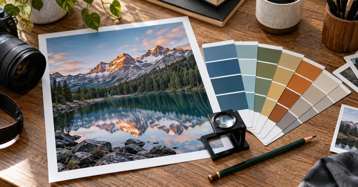
What “extract colors from an image” actually means
A photograph rarely contains five colors; it contains hundreds of thousands of slightly different ones. A palette generator is therefore not finding colors that are literally there — it is summarising a huge cloud of pixels into a few representative ones. This tool does that with k-means clustering in the CIELAB color space, and knowing what that means helps you read the result and pick good settings.
Step by step: what happens after you drop a photo
- Decode and downsample. The browser decodes the image and scales it to at most 512 px on its long side — a thumbnail has the same colors as the full photo, and this keeps the analysis fast on a phone.
- Drop transparent pixels. With “ignore transparent pixels” on (the default), pixels with alpha below half are removed first, so a logo on a transparent PNG is analysed as a logo rather than as a logo plus a phantom black or white swatch of padding.
- Convert to CIELAB. Each remaining pixel goes from sRGB to CIELAB, a space designed so that straight-line distance roughly matches how different two colors look. A dark red and a dark green can be numerically close in RGB; in Lab they are far apart, which is what clustering should “feel”.
- Seed and iterate. The cluster centres are placed with k-means++ seeding — each new centre is picked with probability proportional to its squared distance from the ones already chosen, so the seeds spread across the colors present instead of huddling in the largest region. Lloyd iterations then assign every pixel to its nearest centre and move each centre to the mean of its pixels until they stop moving.
- Read out the palette. Each final centre is one swatch — the average of the pixels assigned to it — and the share under it is the fraction of counted pixels in that cluster.
The random choices come from a seeded pseudo-random generator, so the process is deterministic: the same image and settings always give the same palette.
Why counting pixels lies about “dominant colors”
The naive approach to dominance is a histogram: chop RGB into a coarse grid, count pixels per cell, report the fullest cells. It is fast, but it answers the wrong question. A large flat background — a wall, a sky, a backdrop — spreads across several neighbouring cells and can claim three or four of your five slots with near-identical shades, while a small, vivid subject (a red mug, a yellow raincoat) never fills one cell enough to appear. Median-cut and octree quantizers, the classic GIF-era methods, share a milder form of the same bias because they split boxes by pixel count in RGB.
k-means in Lab is not immune to area — a photo that is 70% grey wall still gives a grey-heavy palette — but it merges the near-identical shades into one centre and frees the remaining slots for perceptually distinct colors. That is why the “Product shot on white” example returns the product's colors with a single white, and why the share column is worth reading: a color at 2% may still be the accent your scheme should hinge on. If the accent is smaller still, use the eyedropper — clicking the preview adds that exact pixel as a manual swatch, no averaging involved.
Choosing the number of colors — and what “Auto” does
There is no mathematically correct palette size, only the size that suits the job. On Auto, the tool runs a quick k-means fit for several candidate counts between 2 and 12, records how tightly the pixels sit around their centres (the within-cluster sum of squares) for each, and picks the count at the knee of that curve — the point after which another color stops buying much fidelity. It is a heuristic, not an oracle: it tends to suggest few colors for flat graphics and more for photographs, and you can override it with one click.
| Goal | Suggested count | Sort by |
|---|
| Brand or UI scheme from a hero photo | 4–6 | Dominance |
| Mood board / presentation | 6–8 | Hue |
| Reduced palette for pixel art or a craft chart | 10–16 | Lightness |
| Checking what a logo really uses | Auto | Dominance |
HEX, RGB, HSL and Lab: which one do you need?
Each notation is useful somewhere different. HEX is the lingua franca of CSS, Figma, Sketch and design systems. RGB is what canvas, WebGL and most APIs want. HSL is for editing: a lighter tint or a muted hover state is one change to L or S while the hue stays put, whereas in RGB all three channels move. Lab is where the clustering ran and the space to use when reasoning about how different two colors look — the nearest CSS named color is simply the smallest straight-line (ΔE) distance in Lab. Sorting by hue walks the color wheel (greys are pushed to the end so it stays readable); sorting by lightness uses the Lab L value, light to dark.
Transparency and PNGs
Transparent regions have no meaningful color, and how a tool treats them changes the palette. Here they are excluded before clustering when the toggle is on, and shares are computed over opaque pixels only. Turn the toggle off if the transparency is itself meaningful — a sticker whose semi-transparent shadow you want represented — and note that a fully transparent image yields an empty palette rather than an invented one.
Using the palette in CSS, Tailwind, Figma and GIMP
- CSS / SCSS: the export writes
--palette-1: #…; custom properties inside :root (or $palette-1 SCSS variables), each with the nearest name and share as a comment, so the file documents itself.
- Tailwind: the fragment is a
theme.extend.colors object with 100/200/300… keys, ready to paste into tailwind.config.js; in Tailwind v4 the same values become --color-palette-100 lines in an @theme block.
- Figma, Sketch, Canva: copy HEX values one by one, or copy the plain-text export and paste it into a styles document.
- GIMP, Inkscape, Krita, Aseprite: download the
.gpl file. It is GIMP's plain-text palette format (a GIMP Palette header, a name, then one R G B name row per color) and those programs import it directly into their palette dialogs.
Accessibility: reading the contrast hints
The label on each swatch is black or white — whichever gives the higher WCAG 2.1 contrast ratio against that color, from the standard relative-luminance formula. It is a small built-in check, not a full audit: WCAG asks for 4.5:1 for normal text and 3:1 for large text and UI components, and the label only tells you which of the two would fail later. Use it to sort your extracted colors into “can carry text” and “background only”.
When NOT to use this tool
k-means gives you representative averages. If you need the exact brand HEX from a flat logo, use the eyedropper or set the count to the number of flat colors; a photograph of a printed logo will never return the specification value because lighting and JPEG compression have already changed it. Smooth gradients are summarised into a few bands — right for a scheme, wrong if you wanted the gradient itself. And this is not a color-blindness simulator or a full contrast checker.
Working with the rest of the photo-art tools
The palette engine here is the one behind our pixel art generator, paint-by-numbers generator and coloring page generator. Extract a palette first to see how many distinct colors a photo genuinely holds, then run the same image through the pattern tool with a matching count.