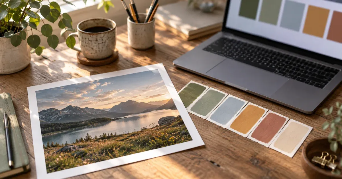
Why start a palette from a photograph at all?
Almost every color scheme that feels “right” has a reference behind it: a landscape, a piece of fabric, a product, a film still. Photographs are useful starting points because the physical world already solves the hard part — the colors in a real scene share the same light, so they belong together in a way that five randomly picked HEX values never will. Sunlight warms every surface it hits; overcast skies cool them; a single lamp ties a whole room to one hue. Borrowing from a photo means borrowing that coherence for free.
The catch is that “borrowing colors from a photo” is vaguer than it sounds. A photo has hundreds of thousands of distinct colors, most of them one JPEG artifact away from each other, and the ones your eye considers important are rarely the ones that cover the most pixels. This guide walks through the whole process: choosing a photo that will produce a workable palette, understanding what a palette extractor really computes, deciding which colors are your base and which are your accents, checking harmony and contrast, and finally exporting the result as something a developer or a printer can use. Where it helps, we use our own color palette generator from image, which runs entirely in your browser, but the reasoning applies to any extractor.
Step 1 — choose a photo that can become a palette
Not every good photograph makes a good palette. The properties that matter are different from the ones that make a picture worth framing:
- A limited, deliberate cast of colors. A close-up of a rusted door against a teal wall gives two strong hues and their shades. A busy street market gives forty. Extractors summarise; the more colors present, the more the summary averages things you did not want averaged.
- Consistent light. Mixed lighting — tungsten inside, daylight through the window — splits every surface into two colors and produces a palette that fights itself. Golden hour, overcast days and single-source studio light produce palettes that hang together.
- Enough contrast to give you a dark and a light. A usable UI scheme needs at least one color that reads as “ink” and one that reads as “paper”. A photo that is all mid-tones will give you five variations of the same medium value and nothing to write text with.
- An accent you care about. If the reason you love the photo is the tiny orange kayak on the grey lake, know in advance that the kayak is a few hundred pixels and the lake is a few hundred thousand — you will need to fetch it deliberately (more on that below).
Cropping is your first tool. Cropping to the part of the photo that has the colors you want removes the parking lot in the corner and the white sky that would otherwise eat two slots. And a downsampled copy is fine: an extractor working on a 512 px version of the picture sees the same colors as one working on the 24-megapixel original, only faster.
Step 2 — understand what the extractor is actually doing
Palette tools differ more than their similar-looking swatch strips suggest, and knowing which kind you are using tells you how to read its output. Broadly there are three families.
Histogram binning
The simplest method chops RGB into a coarse grid (say 8×8×8 cells), counts the pixels in each cell and reports the fullest cells. It is quick, but a large flat area — sky, wall, backdrop — spreads across neighbouring cells and claims several slots with almost identical shades, while a small vivid subject never fills a cell enough to appear.
Median-cut and octree
The classic quantizers from the GIF and 8-bit era repeatedly split the color cube into boxes weighted by pixel count. They are better than binning and are what many image editors use for “reduce to N colors”, but they still work in RGB, where numeric distance is a poor proxy for how different two colors look, and they still favour area over salience.
k-means clustering in a perceptual space
The approach our palette generator uses converts every opaque pixel to CIELAB, a color space designed so that straight-line distance approximates perceived difference, then runs k-means: it places the requested number of cluster centres with k-means++ seeding (each new seed is chosen with probability proportional to its squared distance from the seeds already placed, so the starting points spread across the colors present), then repeats two steps — assign each pixel to its nearest centre, move each centre to the mean of its pixels — until the centres stop moving. Each final centre is one swatch, and its share is simply the fraction of pixels that ended up in that cluster. Because the random seeding uses a fixed seed, the same photo and settings always give the same palette.
Two consequences are worth internalising. First, every swatch is an average. Nobody painted that exact HEX; it is the centre of a cloud of similar pixels. That is what you want for a scheme (averages are smoother and more usable than any single noisy pixel) but it means a photograph of a printed brand logo will not return the brand's specification color — lighting and compression have already moved it. Second, the algorithm follows area. A cluster centre goes where the pixels are, so a photo that is mostly grey lake will still produce a grey-heavy palette. What k-means in Lab does better than binning is refuse to spend three slots on three greys your eye cannot tell apart; it merges them and hands the freed slots to colors that are genuinely different — which is often enough for a small accent to win one.
Transparency deserves a note. In a PNG with a transparent background the empty pixels have no meaningful color, and an extractor that counts them will report a phantom black or white. A good tool drops pixels below an alpha threshold before clustering and computes shares over the opaque pixels only. Ours does this by default; switch it off only when the transparency is part of the design you want to represent.
Step 3 — dominant colors are not the same as important colors
Read the share column, not just the swatches. A typical landscape gives something like: sky blue 38%, mid-grey cloud 24%, dark green treeline 19%, warm sand 15%, and a 4% sliver of orange from a jacket. In terms of a scheme those five colors play very different roles:
| Role | Typical share | Where it goes |
|---|---|---|
| Base / background | 30–60% | Page background, large surfaces, cards |
| Secondary surface | 15–30% | Sidebars, alternate rows, section bands |
| Text / ink | 10–20% (or fetched) | Body text, icons — must be dark or light enough for contrast |
| Accent | 1–8% | Buttons, links, highlights, the one thing you want noticed |
The accent is the color most likely to be missing from an automatic palette, and it is the color you can least afford to lose. Three fixes, in order of preference:
- Raise the count. Asking for 8 or 10 colors instead of 5 frees slots for the small clusters. You can always discard the extra greys afterwards.
- Crop to the accent and run a second extraction; take its dominant color as your accent.
- Use the eyedropper. Our tool lets you click any point in the preview to add that exact pixel color as a manual swatch, no averaging. This is the right move for a logo dot or an eye highlight.
Conversely, dominance can mislead in the other direction. A product shot on a white sweep is 70% white, and white is not part of the product's identity — it is packaging. Treat high-share neutrals as candidates for background, not as “the brand color”, and let the second and third swatches carry the personality.
Step 4 — check the harmony (and don't over-think it)
Traditional color theory describes schemes by where their hues sit on the color wheel. Complementary schemes pair hues roughly opposite each other (blue and orange, red and green); analogous schemes use neighbours (yellow, yellow-green, green); triadic schemes space three hues evenly; monochromatic schemes use one hue at several lightness and saturation levels. These are descriptive categories, not laws — plenty of beautiful palettes fit none of them — but they are a quick sanity check on an extracted set.
The practical way to check is to sort the palette by hue and read the H values in the HSL notation. A landscape often turns out to be complementary without anyone planning it: sky and water sit near 200–220°, sand and sunlit rock near 30–40°, and that 180° gap is exactly why the scene felt balanced. If your extraction returns hues scattered every 40° with no structure, that usually means the photo had mixed light or too many subjects — go back to step 1 and crop, rather than trying to force the numbers.
Sorting by lightness answers a different question: does the palette have a real range from dark to light? A scheme with all its L values between 40 and 60 will look muddy on screen no matter how nice the hues are. If it does, keep the hues and manufacture the range yourself — take your base hue into HSL, lower L to 15–20 for an ink color and raise it to 95–97 for a paper color. That is the point of having HSL on every swatch: it lets you derive tints and shades without changing the hue.
Step 5 — turn it into something you can ship
A palette that lives in a screenshot is decoration. A palette that lives in a file is a design token. The formats that matter, in rough order of how often people need them:
- CSS custom properties. A block of --palette-1: #…; lines inside :root. Rename them semantically before you commit (--color-bg, --color-ink, --color-accent) — numbered names rot the moment you reorder the palette.
- SCSS variables. Same idea for Sass projects.
- Tailwind. A theme.extend.colors object with 100/200/300… keys pastes into tailwind.config.js; in Tailwind v4 the same HEX values become --color-* lines in an @theme block, per the Tailwind theme documentation. Note that the numbered scale a generic export produces is a list, not a true tint ramp; for a real 50–950 ramp derive the steps from one hue in HSL.
- JSON. The neutral interchange format for design-token pipelines and for handing a palette to a script.
- GIMP .gpl. A plain-text palette file (a GIMP Palette header, a name, then R G B name rows) that GIMP, Inkscape, Krita and Aseprite import directly, documented in the GIMP Palettes dialog manual. If your palette is heading for illustration or pixel art rather than a website, this is the one you want.
- A PNG palette card. For the mood board, the client deck or the social post — the swatches with their HEX printed on them.
Our extractor writes all of these from the same swatches, and each swatch's HEX, RGB and HSL values are click-to-copy for the times you only need one number in Figma or Sketch. Whatever tool you use, the rule is the same: export once, name semantically, and never retype a HEX by hand.
Step 6 — check contrast before you commit
A palette can be harmonious and still unusable, because harmony says nothing about legibility. The WCAG 2.1 contrast ratio is the standard measure: it compares the relative luminance of two colors and produces a number from 1:1 (identical) to 21:1 (black on white). WCAG asks for at least 4.5:1 for normal body text and 3:1 for large text and user-interface components. Extracted photo palettes fail this test more often than hand-picked ones because photographs are full of mid-tones — the sand and the sky may look lovely together at 2.1:1 and be unreadable as text on background.
Do the check early. Our tool prints each swatch's label in black or white, whichever has the higher WCAG contrast against that color; a swatch that gets a white label is telling you black text on it would fail sooner than white text would. That is a triage hint, not a full audit — run your final text/background pairs through a proper contrast checker — but it quickly separates the colors that can carry text from the ones that are background only. When a favourite pairing fails, keep the hue and move the lightness: dropping the ink color's L in HSL by ten points is usually enough, and it preserves the photo's character far better than swapping the color entirely.
Beyond the screen: printing, paint-by-numbers and pixel art
Palettes extracted from photos are just as useful away from CSS. Two of the tools in this same section use exactly the same k-means-in-Lab quantizer, so a palette you extract here is the palette they will paint with:
- Paint-by-numbers. A paint-by-numbers kit is a reduced palette plus regions. Extracting the palette first tells you how many paints a photo genuinely needs and lets you swap an awkward mid-tone for one you can actually mix; our guide to a custom color palette for paint-by-numbers covers the workflow, and the paint-by-numbers generator accepts the result.
- Pixel art. Reduced palettes are the essence of pixel art, and the difference between 8 and 16 colors changes the whole look. Start with how to turn a photo into pixel art, then read dithering: Floyd–Steinberg vs ordered to understand why a small palette needs a dithering choice, and export the .gpl so Aseprite paints with the same colors.
- Print. Screen HEX values are sRGB; a printer works in CMYK and cannot reproduce every screen color, particularly saturated blues and greens. When a palette is heading for print, expect the printer's proof to be duller than the monitor and treat the extracted values as targets to match by eye, not absolute specifications.
Common mistakes (and the fix for each)
- Trusting the top swatch as “the color”. The largest cluster is usually background or sky. Fix: read shares as roles — base, surface, ink, accent — and pick the identity color from the second tier or the accent.
- Extracting from a photo of a logo to recover brand HEX. Lighting and compression have altered it. Fix: use the vector or the brand guide; if all you have is a flat PNG, set the count to the number of flat colors or use the eyedropper.
- Letting a transparent background into the count. Fix: keep “ignore transparent pixels” on for logos and stickers.
- Asking for too few colors. Five is a scheme, not an inventory. Fix: extract at 8–10, then curate down to your roles.
- Skipping the contrast check. Fix: test the text/background pairs at 4.5:1 before the palette reaches a component library.
- Numbered token names. --palette-3 means nothing next quarter. Fix: rename to semantic tokens the day you export.
- Comparing tools and assuming one is “wrong”. Different quantizers give different averages of the same continuous image; none is the ground truth. Fix: pick one method, keep its settings, and rely on its determinism for reproducibility.
A worked example, start to finish
Take a coastal photo at golden hour: warm sand in the foreground, blue-grey sea, pale sky, a red lifeguard flag. Cropping out the sky (a fifth of the frame and pure light grey) leaves sand, sea and flag. Extracting at Auto suggests four colors; extracting at 8 returns two sands, three sea tones, a dark wet-rock brown, a pale foam and — at 2% — the flag red. Sorting by hue shows the sands near 35°, the seas near 205°, the red near 358°: a complementary pair plus a hot accent. Sorting by lightness shows the range runs from L 22 (wet rock) to L 88 (foam), so there is a workable ink and a workable paper.
Curating: foam becomes --color-bg, the lighter sand --color-surface, the wet-rock brown --color-ink (it passes 4.5:1 on foam), the mid sea --color-primary and the flag red --color-accent for buttons — with its label reading white, so button text is white. Export as CSS custom properties, rename, commit. Ten minutes, and every color on the site was actually on that beach at that hour, which is exactly why it will look coherent.
Summary
A good photo palette is the product of choosing an image with a limited cast and consistent light, understanding that an extractor returns perceptual averages weighted by area, reading shares as roles rather than rankings, fetching the accent deliberately, checking hue structure and lightness range, testing contrast, and exporting once into semantic tokens. Do those things and the palette will feel like it came from somewhere real — because it did.