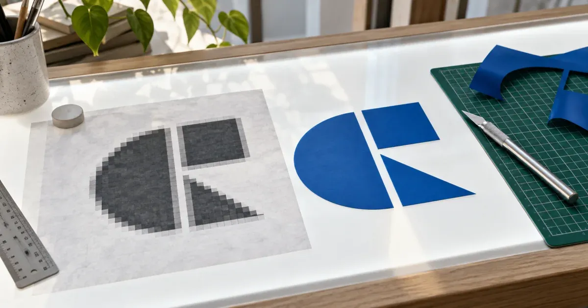
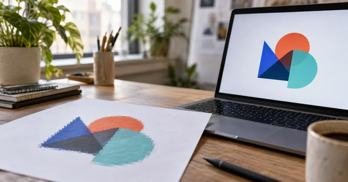
Raster and vector are two different ways to describe a picture
A PNG, JPG, WebP or GIF is a raster: a grid of coloured pixels with a fixed width and height. Enlarge it and the pixels grow into visible squares or blur into mush; there is no information beyond the grid. An SVG is a vector: a text document that describes shapes — paths, curves, fills — in coordinates. A renderer redraws those shapes at whatever size you ask for, so a vector logo prints razor-sharp on a business card and on a shop front, and its file size depends on how many shapes it contains rather than on how big it is drawn. Converting a raster into a vector means inferring shapes that were never stored, which is why the process is called tracing rather than converting, and why the source image matters so much.
The pipeline this converter actually runs
Everything below happens in your browser after the image is decoded and, if needed, downsampled so its longer side is at most 1,024 pixels. The SVG keeps your original pixel dimensions as its width and height, so the file drops into a layout at the same size as the source.
- 1. Flatten transparency. Pixels of a transparent PNG are composited onto white; fully transparent pixels become pure white. This gives a logo on a transparent background one clean, droppable backdrop colour instead of a smear of half-blended fringe.
- 2. Reduce to a palette. In Color mode, k-means clustering with k-means++ seeding groups the pixels into N clusters in the CIELAB colour space, so "similar" means similar to the eye rather than similar in raw RGB numbers. The random generator is seeded, which is why the result is deterministic. With "Auto" selected the tool tries candidate counts from 2 to 16 and picks the knee of the within-cluster variance curve — the point where adding another colour stops buying much fidelity. Grayscale mode skips clustering and snaps each pixel to the nearest step of a uniform grey ramp with N levels. Black & white mode compares each pixel's luminance with your threshold and labels it dark or light.
- 3. Merge and clean up. In Color mode, adjacent palette entries closer than a ΔE of 4 are merged, because two fills that differ by less than the eye can tell only add paths. Then the tool finds the connected regions of every colour and merges any region smaller than the minimum region size into a neighbour — preferring a neighbour of a similar colour. This is what removes JPEG mosquito noise, dust on a scan and the one-pixel anti-aliasing fringe around letters.
- 4. Trace the boundaries. Every unit edge of the pixel lattice where two regions differ is a boundary edge. The edges are stitched into arcs between the points where three or more regions meet, and each arc is simplified with the Douglas–Peucker algorithm exactly once, then shared verbatim by both regions it separates. That single detail is why neighbouring fills in the output are watertight: they were never simplified independently. Soft vertices are then rounded into quadratic Bézier curves while sharp corners are kept as corners. The smoothing slider maps to the Douglas–Peucker tolerance, from 0.5 px (keeps the pixel staircase almost intact) to 4 px (very smooth, small features may round off).
- 5. Emit the SVG. Each region becomes one
<path> with fill-rule="evenodd", so a ring or a letter "O" is a single path with a hole. Paths are grouped by colour inside <g fill> elements, largest regions first, so the drawing order is stable and a vector editor shows one group per colour. When the background is not transparent, a rectangle in the dominant colour is painted first so anti-aliasing seams never show the page behind. Up to 5,000 paths are written; if the image would need more, the smallest regions are dropped and the stats panel says so.
What the controls really change
- Colours sets the number of k-means clusters (or grey levels). Fewer colours mean fewer regions, fewer paths, smaller files and a more poster-like look. A three-colour logo traced with 16 colours does not become more faithful — it grows anti-aliasing colours you did not want. Start with Auto, then go down, not up.
- Smoothing is a distance in pixels. Low values are right for pixel art or when the source is already crisp; high values are right for scanned drawings and JPEG-compressed logos where the "detail" is really noise.
- Minimum region size is a pixel area. Raise it until specks vanish but stop before the dot on an "i" or the counter of an "e" disappears — the compare handle in the preview is there for exactly that check.
- Threshold (black & white only) is the luminance cut-off from 0 to 255. Lower it to thicken faint pencil lines; raise it to drop paper texture and shadows.
- Transparent background drops the palette colour that dominates the image border, but only when that colour covers at least 30 % of the border. A logo boxed in white on a busy backdrop will not be detected — crop first.
When tracing works, and when it does not
Region tracing rewards images that were vectors once, or were drawn as flat shapes: logos, icons, pictograms, flat illustrations, stickers, stamps, silhouettes and scanned line drawings. It also handles chunky pixel art and screenshots of simple diagrams well. It is candidly the wrong tool for photographs, soft gradients, drop shadows, glows and small text. A photograph traced with eight colours becomes a posterised, flat-colour poster — sometimes attractive, never a photo. A gradient becomes visible bands. Text below roughly 20 px on the working raster loses its counters and becomes blobs; if the words matter, retype them in the vector editor over the traced shapes.
Automatic tracing vs the alternatives
| Aspect | This tool (browser) | Manual redraw in a vector editor | Desktop auto-trace feature |
|---|
| Privacy | Image never leaves the device | Local | Local (some cloud tracers upload) |
| Time | Seconds | Minutes to hours | Seconds to minutes |
| Fidelity to the source | Follows the pixels; artefacts are traced too | As good as the artist | Follows the pixels, more presets |
| Clean geometry (true circles, exact strokes) | No — approximated curves | Yes | No — approximated curves |
| Colour control | 2–32 colours or Auto, three modes | Unlimited | Varies by product |
| Software needed | A browser | Vector editor and skill | Installed desktop application |
| Best for | Logos, icons, flat art, scans, cut files | Brand-critical logos, type | Batch work inside an existing workflow |
When NOT to use this tool
- You need a mathematically clean logo for a brand guideline — trace it here to get a base, then redraw the key shapes over it.
- The image is a photograph and you want it to still look like a photograph. Use an image compressor or format converter instead.
- The subject depends on gradients, shadows or transparency effects; flat fills cannot represent them.
- The important content is small text; retype it in a vector editor with the real typeface.
- You already have the original vector file (AI, EPS, PDF, SVG). Converting a raster export back is always worse than the source.
SVG for cutting machines and embroidery
Vinyl cutters, plotters and craft cutting machines follow the outlines of filled paths, so a good cut file has few colours, closed shapes and no background rectangle. Choose Black & white or two to four colours, raise the minimum region size so no speck becomes a tiny cut, turn on transparent background so the sheet outline is not traced, and check the path count — each path is a shape the machine will cut. Because each colour is grouped in its own <g>, most cutting programs treat a colour as one layer, which maps neatly to one sheet of vinyl per colour.
Related photo-art tools
The same region engine powers our coloring page generator, which keeps only the outlines, the paint-by-numbers generator, which numbers each region against a palette, and the pixel art generator, which quantises to a coarse grid instead of tracing. Use whichever output your project needs — the pixel data never leaves your browser in any of them.