One picture made of many pictures
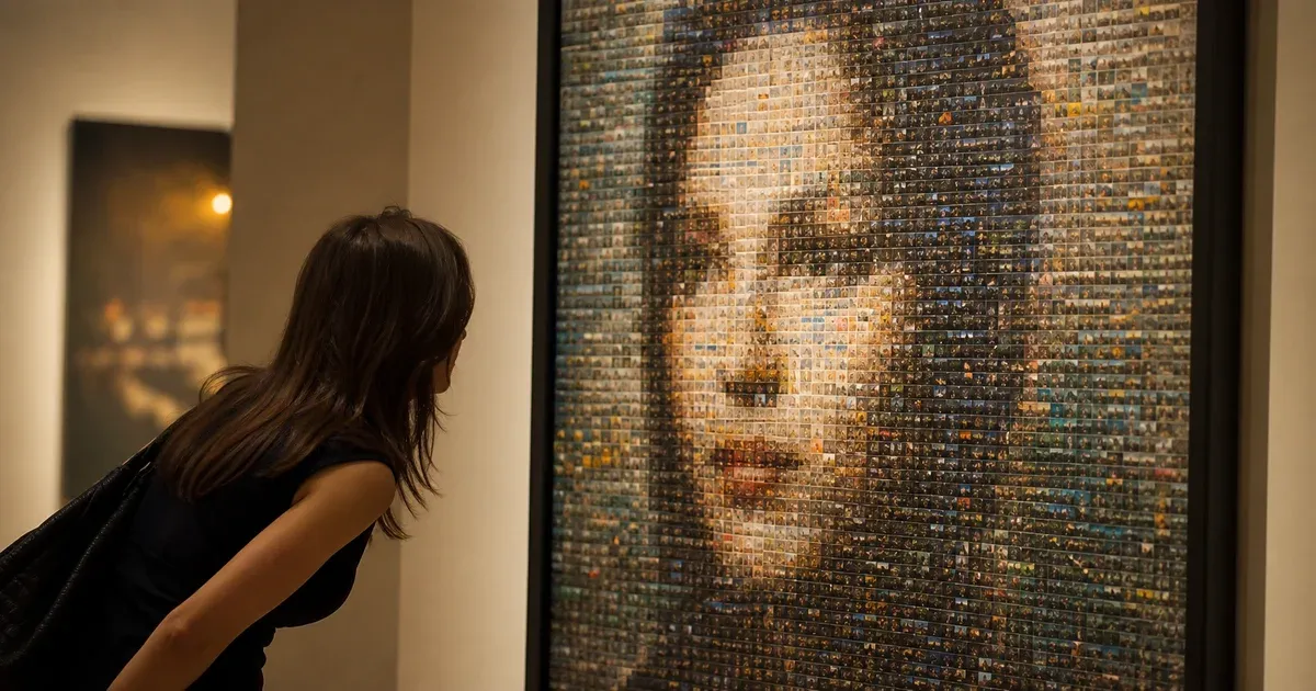
A photo mosaic is a single large image reconstructed from hundreds or thousands of smaller photographs. Seen from across a room it reads as the original portrait or landscape; seen from arm's length it dissolves into the individual pictures it is made of. That double reading is the whole appeal, and getting both halves right is a matching problem: for every small area of the target image, which of your photos belongs there?
Slicing the target into a grid
The generator first divides the target photo into a grid. You choose how many tiles go across the width; the number of rows is derived from the target's own aspect ratio, so nothing is stretched or letterboxed. The total cell count is capped so a very tall photo at a very fine setting cannot lock up your browser. Each cell is then a small rectangle of the original picture that needs a photo standing in for it.
The 4×4 color signature
Every image involved — each cell of the target and each tile photo you upload — is reduced to the same compact description: a 4×4 grid of average colors, each converted to CIELAB. That is sixteen cells of three numbers, forty-eight values per image. CIELAB is used because distances in it correspond reasonably well to how different two colors look to a human eye, which plain RGB distance does not. Matching is then nearest-neighbour search: for each target cell, find the tile photo whose signature is closest.
Keeping the grid instead of collapsing each photo to a single average color is the point of the whole design. An average tells you a photo is roughly mid-blue; it cannot tell you whether that photo is a bright sky above a dark sea or an evenly blue wall. Those two pictures look nothing alike in place. Because the signature preserves where the light and dark parts of a photo fall, a tile whose top-left is bright will be chosen for a cell whose top-left is bright, and the internal structure of each small photo lines up with the structure of the region it is filling. That is what makes a mosaic hold together up close and not only from a distance.
Repeats and the proximity penalty
Unless you upload as many photos as there are cells, tiles must repeat — that is normal and expected, not a defect. What ruins a mosaic is not repetition but clumping: the same picture appearing three times in a row across a patch of sky. The generator therefore adds a proximity penalty during matching, so a tile that has recently been used nearby becomes a worse candidate than its raw color distance alone would suggest. The variety control sets how strong that penalty is. Low variety takes the closest match every time and accepts clusters; high variety spreads repeats out across the canvas at the cost of slightly looser color matches. The penalty is bounded, so even at maximum variety the tile that gets placed is never wildly wrong for its cell.
Tinting toward the target
Even with a large photo library, no tile is an exact match for its cell. Each placed photo is therefore blended toward the average color of the cell it fills by an adjustable amount. At 0% tint the photos are left completely untouched — the small pictures are perfectly visible, but the big picture may only be readable from a distance. At 100% the target image reproduces almost perfectly while the individual photos fade into flat color. Everything interesting is in between, and the right value depends mostly on how many photos you have: a large, varied library needs very little tint, while a couple of dozen photos across a thousand cells will need a lot.
Dithering: how twenty photos cover a thousand cells
When your tile set cannot cover the range of colors in the target, whole regions get the same slightly-wrong photo and the mosaic bands into flat patches. Optional Floyd–Steinberg error diffusion fixes this the same way it lets an eight-color pixel-art image still read correctly: the difference between what a cell wanted and what its chosen tile actually provides is pushed into the neighbouring cells that have not been filled yet. Those neighbours then compensate in the opposite direction, and the eye averages the alternation into the intended color. It is the single most effective setting when you have far fewer photos than cells.
Exporting at print resolution
The preview is deliberately small so it can re-render while you move a slider. The download is not derived from it. Each tile photo is held in memory as a 160-pixel working thumbnail, which is all the preview can show. When you export, any tile whose final cell is larger than that thumbnail is re-drawn from its original uploaded photo at the true cell size — one photo at a time, released again before the next, so a big export never has to hold the whole album at full size at once. Below 160 pixels per cell the stored thumbnail already carries more detail than the cell can display and nothing is re-decoded. Either way the small pictures are genuinely sharp rather than an enlargement of preview pixels. You can specify the output either as an exact pixel width or as a paper size plus DPI, and the result is clamped to a safe rendering ceiling — 10,000 pixels on the long side and 30 megapixels of total area — because a canvas beyond that returns blank on many devices, particularly mobile. That ceiling is real and it is the honest limit of the tool: a poster-sized mosaic at 300 DPI is within reach, a billboard is not.
Getting a good result
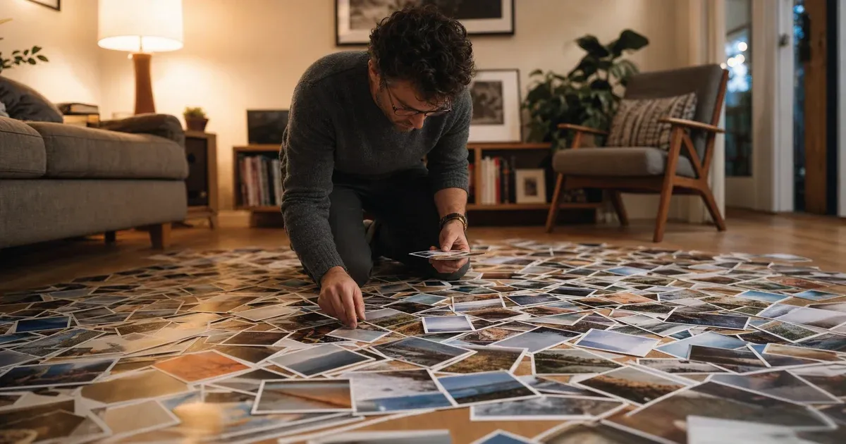
Mosaic quality depends far more on your photo library than on any setting here. Aim for at least a few hundred varied images, and vary them in brightness above all — a folder of a thousand photos all shot in the same evening light gives the matcher almost nothing to work with, while two hundred pictures spanning bright beaches and dark interiors will cover the target's tonal range. For the target image itself, pick something with a strong, simple silhouette: a face, a pet, a logo, a skyline. Fine text and delicate detail will not survive being rebuilt out of photographs at any grid size. If you want another way to reinterpret the same photo, our pixel art generator uses the same dithering idea with a fixed palette instead of a photo library.