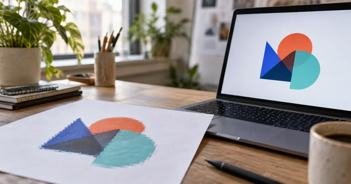
Why "just convert it to SVG" is harder than it sounds
Someone asks for the logo "as a vector" and all you have is a PNG from an old website or a JPG pulled from a letterhead scan. It happens to freelancers, marketing teams, print shops and small businesses every week. The request is reasonable — a printer, a sign maker, an embroiderer or a developer needs a file that scales — but a PNG or JPG does not contain shapes. It contains pixels. Converting it to SVG means reconstructing shapes that were never stored, and doing that well is a matter of preparing the source, choosing the right settings, checking the result and knowing when to stop and redraw instead.
This guide walks through that process end to end with our image to SVG converter, which traces the file entirely in your browser — nothing is uploaded — and produces a plain SVG you can open in Inkscape, Illustrator, Affinity Designer, Figma or your cutting-machine software. Everything here also applies, with small differences, to any region-based tracer.
Raster vs vector, in the terms that matter for a logo
A raster image (PNG, JPG, WebP, GIF) is a fixed grid of coloured pixels. Its quality is capped by its resolution: a 200 px logo can never become a sharp 2,000 px logo, only a blurred or blocky one. A vector image (SVG, and the native formats of vector editors) stores shapes as coordinates — lines, curves, fills — and is redrawn at whatever size the output needs. The W3C SVG specification defines the format as XML text, which is why an SVG can be opened in a text editor, styled with CSS, and versioned in git alongside code.
Three consequences matter for logos:
- Size independence. One vector file serves the favicon, the letterhead and the shop front. No more "please send a bigger PNG".
- Editability. Colours can be swapped, shapes moved, and the wordmark separated from the symbol — provided the traced shapes are clean enough to be worth editing.
- Machine readability. Cutting plotters, engravers and embroidery digitisers all follow vector outlines. A raster is useless to them until it becomes paths.
The catch is that tracing reproduces what is in the pixels, artefacts included. Anti-aliasing fringes, JPEG blocks and scanner dust all become shapes unless the process removes them. Good results are mostly about controlling what goes in and what gets merged away.
Step 1 — Prepare the source image
Ten minutes on the source saves an hour of clean-up later. In rough order of importance:
Find the largest, cleanest copy
Look for the biggest version that exists: an original export, the copy in a press kit, a high-resolution email signature asset, or the version embedded in a PDF. Bigger is better, up to a point — the converter downsamples the working image so its longer side is at most 1,024 px before tracing, so a 4,000 px source is not traced at 4,000 px, but a large source downsampled cleanly beats a small source blown up. Prefer PNG over JPG when both exist: JPG compression adds ringing around edges that will be traced as tiny extra regions.
Crop tight and isolate the logo
Crop away letterhead text, page borders, photos and anything else. Two things depend on this. First, the automatic colour count is estimated from the whole image, so a photograph in the corner steals colours from your logo. Second, the transparent-background option removes the colour that dominates the image border, and only when that colour covers at least 30 % of the border; a logo boxed in white on a busy background will not be detected. After cropping, the logo's backdrop should touch the frame on all sides.
Fix contrast and background before tracing
If the logo sits on a light grey scan, a coffee-coloured old photocopy or a subtle gradient, levels or a threshold in any image editor will separate the marks from the paper far better than any tracer can. For a one-colour mark, converting the source to black and white first — or using the converter's own black-and-white mode with the threshold slider — gives the tracer exactly two regions to work with.
Remove what you do not want to keep
A drop shadow, a glossy highlight or a "swoosh" gradient will not survive as flat fills; they become bands. If the brand can live without them, paint them out before tracing. If it cannot, plan to rebuild those effects in the vector editor afterwards rather than expecting the trace to produce them.
Step 2 — Understand what the converter does with your file
Knowing the pipeline is the fastest way to predict what a slider will do. The converter runs these stages, all in the browser:
- Transparency is flattened onto white. Fully transparent pixels become pure white, partially transparent edge pixels are blended against white. A logo on a transparent PNG therefore gains one clean backdrop colour that can be dropped later.
- The image is reduced to a palette. In Color mode, k-means clustering (with k-means++ seeding and a fixed seed, so it is deterministic) groups pixels into N colours in the CIELAB colour space, where distances approximate what the eye sees — see the Wikipedia overview of colour quantization. "Auto" tries counts from 2 to 16 and picks the elbow of the within-cluster variance curve. Grayscale mode snaps each pixel to a uniform ramp of N greys; Black & white applies a luminance threshold.
- Similar colours and specks are merged. Adjacent palette colours closer than a ΔE of 4 are collapsed, then any connected region smaller than the minimum region size is absorbed by a neighbour, preferring one of a similar colour.
- Boundaries are traced and simplified. Every edge between two regions on the pixel grid becomes part of a boundary arc; each arc is simplified with the Douglas–Peucker algorithm exactly once and shared by both regions, so neighbouring fills never open hairline gaps. Soft vertices are rounded into quadratic Bézier curves; sharp corners stay sharp.
- The SVG is written. One
<path>per region with the even-odd fill rule (so a letter "O" is one path with a hole), grouped by colour, largest regions first, an optional background rectangle, at most 5,000 paths.
Nothing here detects edges with a filter or guesses shapes with a model. It is a region tracer, in the family of tools that includes the open-source Potrace by Peter Selinger, though the implementation is its own. That matters for expectations: it is excellent at flat shapes and honest about photos.
Step 3 — Choose the mode and the number of colours
Count the real colours in the logo, then set that number — not more. A red-and-navy logo on white is three colours; the anti-aliased pixels between red and white are not a fourth colour, they are noise, and asking for eight colours forces the tracer to invent regions for them.
- Black & white for single-colour marks, scanned line art, stamps and signatures. Move the threshold slider (0–255) until thin strokes are solid but the paper stays clean; lower thickens faint lines, higher drops texture and shadows.
- Color with 2–6 colours for typical logos. Start with Auto to see what the estimator suggests, then step down until a colour you need disappears — and go one step back up.
- Grayscale for shaded illustrations and greyscale marks, where a uniform grey ramp reads better than clustered colours.
The stats panel reports the colours actually used after merging, which is often fewer than requested; that is the merge step doing its job.
Step 4 — Set smoothing and minimum region size
These two sliders decide whether the SVG looks like a drawing or like a photocopy of pixels.
Smoothing maps directly to the Douglas–Peucker tolerance, from 0.5 px (the pixel staircase is preserved almost intact) to 4 px (curves are very smooth and small features round off). For a crisp, high-resolution PNG a low-to-middle value keeps corners honest. For a JPEG logo or a scan, a higher value smooths compression ripple along edges. Watch the corners of squares and the terminals of letters as you move it — over-smoothing turns a sharp serif into a blob.
Minimum region size is a pixel area (1–64 px on the working raster). Every region smaller than it is merged into a neighbour. Raise it until dust, JPEG mosquito noise and edge fringes vanish; stop before the dot on an "i", the counter of an "e" or a registered-trademark symbol disappears. The compare handle over the preview exists for exactly this check — drag it across the letters.
If the path count is still in the thousands, that is a sign the source is noisier than it looks. Go back to Step 1 and clean the image, rather than pushing the sliders to extremes.
Step 5 — Drop the background
A logo that arrives boxed in white looks amateurish on a coloured slide, a dark website or a printed T-shirt. Turn on transparent background: the converter finds the palette colour that dominates the image border and leaves it out of the SVG, and does not write the background rectangle. This works best when the logo has been cropped so the backdrop touches all four edges. If the logo itself contains large areas of the same colour as the backdrop — white lettering on white — those regions will be dropped too, so give such logos a contrasting backdrop before tracing and drop that instead.
Step 6 — Check the result before you download
Three numbers tell you most of what you need to know.
- Colours used. Should equal the real number of logo colours (plus one for the background if it was kept). More means noise got its own cluster; fewer means two brand colours were merged and you need to raise the count.
- Paths. A clean logo is typically tens of paths, not thousands. Each letter is roughly one path; each hole is inside the same path thanks to the even-odd rule. A path count that reaches the 5,000 cap means the smallest regions were dropped and the source needs cleaning.
- Size in KB. Follows the path count and the smoothing. A logo SVG that weighs more than the PNG it came from is a warning sign, because a good vector logo is usually far smaller than any raster of it.
Then use the compare handle: drag it slowly across the wordmark and the symbol. Look at counters, thin strokes, sharp corners and any curve that should be a true circle. Note what needs fixing by hand — that list is what the next step is for.
Step 7 — Clean up in Inkscape, Illustrator, Affinity Designer or Figma
The SVG opens in every major vector editor because it is plain SVG 1.1 with no scripts and no inline styles. Each colour is a group, which makes the usual clean-up quick:
- Delete strays. Select a colour group and look for tiny paths far from the logo; delete them. Raising the minimum region size before tracing reduces this, but a manual pass catches the rest.
- Simplify or redraw key shapes. A traced circle is a polygon of Bézier segments, not a mathematical circle. For a brand mark, draw a true circle, rectangle or ellipse over the traced one, snap it to size and delete the trace. Do the same for any perfectly straight edge that came out with a slight wobble.
- Retype the text. Traced letters are filled shapes with holes, not editable text. If the typeface is known, retype the wordmark with the real font over the traced letters, match the size, then delete the traced text. If it is not known, keep the outlines — but be aware small text loses its counters when the source is small.
- Assign brand colours. Replace the sampled hex values with the official brand values from the guideline; a JPG never carries exact brand colours.
- Union overlapping shapes. Combine paths of the same colour that visually form one object, so the file is easier to edit and to cut.
Save the master as the editor's native format and export SVG, PDF and PNGs from it. The trace was scaffolding; the cleaned file is the asset.
Preparing an SVG for cutting machines
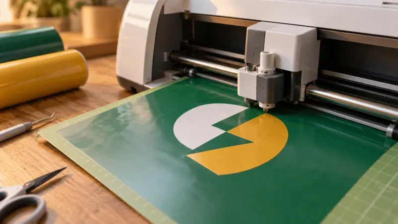
Vinyl cutters and craft cutting machines follow the outlines of filled paths, and every path becomes a cut. For a logo decal, trace with black & white or two to four colours, raise the minimum region size so no speck becomes a tiny cut, turn on transparent background so the sheet outline is not traced, and check the path count — fewer is better. Because each colour is grouped in its own <g>, most cutting programs treat a colour as one layer, which maps neatly to one sheet of vinyl per colour. Weld or union shapes of the same colour that overlap, and remove any interior counters that are too small to weed. Test on a small piece of material before committing a full sheet.
When to redraw instead of tracing
Tracing is fast, but there are cases where a manual redraw is the honest answer:
- The source is tiny. A 64 px favicon or a thumbnail does not contain enough information for any tracer; the result will be blobs. Redraw from the reference.
- The logo relies on gradients, shadows or transparency. Flat fills cannot represent them. Trace the flat parts and rebuild the effects natively.
- It is a brand-critical mark for a guideline. Trace to get proportions and placement, then redraw with true geometry.
- The photograph is the logo. A photo traced at eight colours becomes posterised art. If you need the photo, keep it as a raster and use a compressor or a format converter instead.
- You already have the vector. Search the press kit, the designer's handover, and old print jobs. An original AI, EPS, PDF or SVG is always better than a trace of its raster export.
Common mistakes and how to avoid them
- Tracing a screenshot. Screen captures are small and heavily anti-aliased. Find the asset instead.
- Asking for too many colours. More colours do not mean more fidelity for a flat logo; they mean more regions and larger files. Count the real colours.
- Maximum smoothing to hide noise. It rounds off corners and terminals. Clean the source, raise the minimum region size, and keep smoothing moderate.
- Leaving the background in. A white box on a coloured surface is the most visible sign of a rushed conversion. Crop tight and drop it.
- Trusting sampled colours. Replace them with the official brand palette.
- Skipping the compare check. Ten seconds with the compare handle catches lost counters and merged strokes before they reach a printer.
- Uploading a confidential logo to a random site. Many online vectorisers process files on a server. A converter that runs in the browser keeps the file on your machine, which is the right default for client work.
Related reading and tools
The same region engine that traces logos also drives our other photo-art tools, and the sibling guides explain their trade-offs in the same terms. If you have wondered why a numbered painting template ships as SVG rather than PNG, read SVG vs PNG for paint-by-numbers. If you want the outlines only — a printable page rather than filled shapes — the walkthrough on turning a photo into a coloring page covers the detail and line-thickness controls. And when a client only has a JPG of the logo and no brand palette, our guide to extracting a colour palette from a photo shows how to recover usable hex values before you assign colours in the vector editor.
Conclusion
Converting a PNG or JPG to SVG without losing your logo comes down to a repeatable routine: find the largest, cleanest source; crop tight so the backdrop touches the frame; pick the mode and count the real colours; set smoothing and minimum region size against the compare view; drop the background; read the colours, paths and size; and finish in a vector editor by deleting strays, redrawing true geometry, retyping text and assigning brand colours. The image to SVG converter handles the tracing in your browser and tells you exactly what it did — the judgement about when to stop, and when to redraw, stays with you.