The Question Nobody Answers Up Front
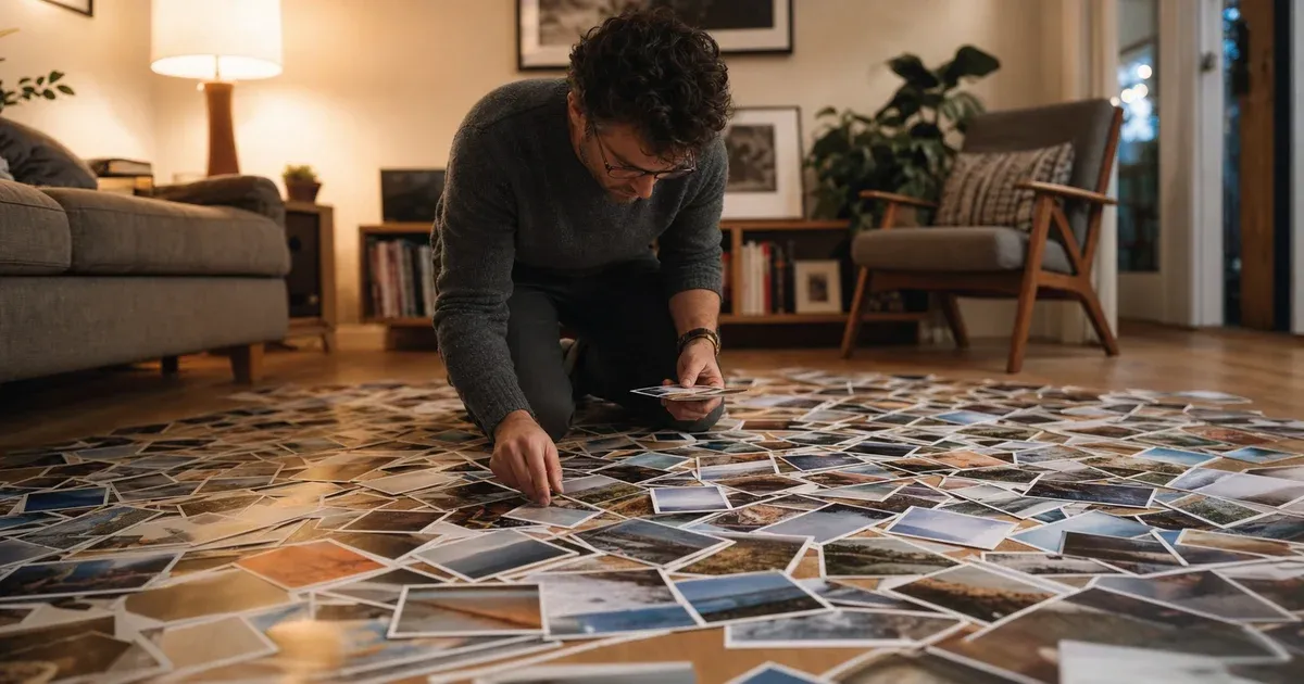
Almost everyone who sets out to make a photo mosaic asks the same thing before anything else: how many photos do I need? It is the right question, and it is very rarely answered honestly. Most mosaic tools present a row of sliders and imply that the settings are what make the result good. They are not. The settings are how you compensate for the library you have. The library itself is what decides whether the mosaic is quietly impressive or an obvious grid of tinted rectangles.
This guide answers the question properly. It walks through the arithmetic that actually governs a mosaic, explains what changes between a twenty-photo mosaic and a three-hundred-photo one, and gives a concrete starting recipe for whatever size of library you happen to own. If you want to follow along with your own pictures, our Photo Mosaic Generator runs everything described here in your browser.
Start With Cells, Not Photos
A mosaic is not really a pile of photos — it is a grid of cells, and every cell needs a picture standing in for it. You choose how many tiles go across the width of the target image; the number of rows follows from the target's own aspect ratio so nothing gets stretched. The total is simply columns × rows, and that number climbs much faster than people expect:
- 20 tiles across a 3:2 landscape photo gives roughly 20 × 13 = 260 cells.
- 40 across gives about 40 × 27 = 1,080 cells.
- 60 across gives about 60 × 40 = 2,400 cells.
- 80 across gives about 80 × 53 = 4,240 cells.
Doubling the tiles across quadruples the cells. That single fact explains almost every disappointment people have with mosaics: they picture "a few hundred photos" as a lot, choose a fine grid because fine grids look better in the examples they have seen, and end up with each photo repeating eight or ten times.
So the number that matters is not how many photos you have. It is the ratio of cells to photos — the average repeat count. A hundred photos on a 260-cell grid is a repeat count of about 2.6. The same hundred photos at 60 tiles across is a repeat count of 24. Same library, wildly different mosaic.
Repeats Are Normal — Clumping Is the Problem
It is worth saying plainly: repeated tiles are expected and are not a defect. Nobody has 2,400 suitable photos, and a mosaic in which every tile is unique is a rare luxury, not the standard. Professional mosaics you have seen in galleries repeat constantly; you simply did not notice, because the repeats were spread out.
What actually ruins a mosaic is clumping — the same picture appearing two or three times in a row across a patch of sky, which the eye picks out instantly as a pattern and which breaks the illusion that the surface is made of many different things. The generator counteracts this with a proximity penalty: a tile that has recently been placed nearby is scored as a worse candidate than its raw colour distance alone would suggest, so the matcher reaches for its second or third choice instead. The variety control sets how strong that penalty is. Turn it up and repeats scatter across the canvas at the cost of slightly looser colour matches; turn it down and you get the closest possible match everywhere, clusters included.
The practical consequence: a high repeat count is survivable, but only if you raise variety to go with it. A small library at low variety is the worst combination there is.
Twenty Photos: The Mosaic Leans on the Tint
Suppose you have twenty photos and a thousand cells. Each picture will appear about fifty times. No amount of clever matching can make twenty images cover the tonal range of a real photograph — there will be cells wanting a pale cream highlight when the nearest thing you own is a mid-grey.
In that situation the mosaic survives on the tint. Every placed photo is blended toward the average colour of the cell it fills by an adjustable amount. At 0% the photos are untouched: the small pictures are perfectly recognisable, but the big picture may barely appear at all. At 100% the target reproduces almost exactly while the individual photos fade into flat colour patches — at which point you have made a slightly textured copy of the original, not a mosaic.
With twenty photos you will be living around 65–85% tint. That is not a failure; it is the correct answer for that library. The mosaic reads clearly from across the room, and walking up to it reveals a ghost of each photograph under the colour wash. It is a real effect and it looks deliberate — as long as you also do two other things: turn variety high, so those fifty repeats are scattered rather than tiled, and turn on smooth blending, which matters more here than anywhere else.
Three Hundred Photos: The Mosaic Leans on the Match
Now the same thousand cells with three hundred photos. The repeat count drops to about three, and something qualitatively different becomes possible: the matcher can usually find a tile that is genuinely close to what the cell wants, so the tint no longer has to do the work of reproducing the target.
At this library size you can drop tint to roughly 25–45% and the big picture still holds together, because it is being built from photographs that are actually the right colours rather than from photographs painted the right colours. That is the mosaic people hope for: recognisable from a distance and made of clearly visible, unmodified pictures up close. Variety can come down too, because with three hundred candidates the matcher rarely needs the same tile twice in a neighbourhood anyway.
This is the trade to keep in your head as you work. Tint and library size are two ways of buying the same thing. Every photo you add is a little less tint you need. If your mosaic looks washed out, the fix is usually not a slider — it is another sixty photos.
Variety of Brightness Beats Raw Count
There is a caveat that catches people who do have a large library. A thousand photos all shot on the same afternoon, in the same light, of the same holiday, is worth much less to a matcher than two hundred photos spanning bright beaches and dark interiors. The matcher is searching for coverage of the tonal and colour range of your target, and a library clustered in one part of that range leaves the rest uncovered no matter how many files it contains.
So when you are gathering photos, deliberately mix: daylight and lamplight, snow and shade, close-ups of colourful objects and wide dim rooms. If your target image is a portrait, you need plenty of mid-tone warm images for skin. If it is a sky-heavy landscape, you need a lot of blue. Two hundred well-spread photos will beat eight hundred lookalikes every time.
Why Layout Counts, Not Just Colour
It helps to know what "a good match" means here, because it is not what most people assume. Each image involved — every cell of the target and every tile photo you upload — is reduced to the same compact description: a 4×4 grid of average colours, each converted to CIELAB. Sixteen little regions, three numbers each, forty-eight values per image. Matching is a nearest-neighbour search over those signatures.
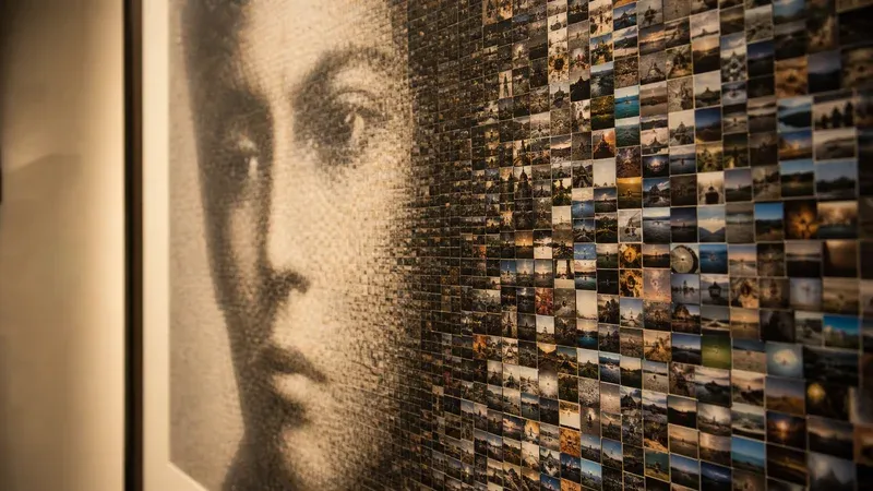
The reason for keeping a grid rather than collapsing each photo to one average colour is worth understanding, because it changes what kind of photos are useful. An average tells you a picture is roughly mid-blue. It cannot tell you whether that picture is a bright sky above a dark sea or an evenly painted blue wall — two images that look nothing alike once they are sitting in a cell. Because the signature preserves where the light and dark areas fall, a photo that is bright at the top and dark at the bottom gets placed in a cell with that same distribution, and the internal structure of the small picture lines up with the structure of the region it fills.
That is precisely what makes a mosaic readable close up rather than only from across the room, and it is why photos with strong internal contrast — a lit face against a dark background, a horizon, a shadow across a wall — are unusually valuable tiles. CIELAB is used for the comparison because straight-line distance in that space corresponds reasonably well to how different two colours look to a human eye, which plain RGB distance does not.
Dithering: How Twenty Photos Cover a Thousand Cells
When your library cannot span the target's colour range, whole regions receive the same slightly-wrong tile and the mosaic bands into flat patches — a stripe of sky that is uniformly a bit too green, next to one that is uniformly a bit too grey. The fix is Floyd–Steinberg error diffusion, offered as the smooth blending option.
The idea is the same one that lets an eight-colour pixel-art image still read correctly. The difference between what a cell wanted and what its chosen tile actually provides is not thrown away; it is pushed into the neighbouring cells that have not been filled yet. Those neighbours then compensate in the opposite direction, and your eye averages the alternation back into the intended colour. If you have seen this technique applied to a limited palette rather than a limited photo library, our guide to Floyd–Steinberg versus ordered dithering covers how and why the two methods look so different.
Dithering is the single most effective setting when you have far fewer photos than cells, and it is close to unnecessary when you have plenty. Treat it as the small-library switch.
A Starting Recipe by Library Size
Assume a target of about 1,000 cells — roughly 40 tiles across a landscape photo — and adjust from there:
- Under 50 photos: drop to 25–30 tiles across, tint 70–85%, variety high, smooth blending on. Accept that this is a tinted mosaic and lean into it.
- 50–150 photos: 35–45 tiles across, tint 50–70%, variety medium-high, smooth blending on.
- 150–400 photos: 40–55 tiles across, tint 30–50%, variety medium, smooth blending optional — compare with it off.
- 400+ photos: 50–70 tiles across, tint 15–35%, variety low-to-medium, smooth blending off. Let the matching show.
Change one control at a time and watch the preview. The tool reports your columns, rows, total tile count and the most times any one photo can be needed — cells divided by photos, rounded up — as soon as your files load, so you can see which band you are in before you start adjusting anything.
Choose Your Target Image Deliberately
The library sets your ceiling; the target sets whether you reach it. A mosaic reconstructs its subject out of blocks of photographs, which means anything depending on fine detail — small text, thin lines, delicate patterns — will be lost at any grid size. What survives is strong, simple structure: a face, a pet, a logo, a silhouette against a clear sky. Crop tight to your subject before you begin, so no cells are spent on background clutter.
This constraint is not unique to mosaics. Every tool that rebuilds a photograph out of a limited vocabulary of parts has the same requirement — it is the same reason a cross-stitch pattern needs a bold subject, and the same advice you will find in our guide to turning a photo into pixel art. If a picture would not read as a small, low-detail thumbnail, it will not read as a mosaic either.
Printing: Where the Grid Meets Real Paper
A mosaic is worth printing large, and the export panel is built for that rather than for thumbnails. You can specify the output as an exact pixel width, or as a paper size plus DPI — A4, A3, A5, US Letter or US Legal at anywhere from 96 to 600 DPI.
Two things are worth knowing. First, the download is not an enlargement of the on-screen preview. Each photo is held as a 160-pixel working thumbnail while you work, and whenever the export's cell size comes out larger than that, the tile is re-drawn from your original file at the true cell size — one photo at a time, released again before the next, so the export never has to hold your whole album at full size at once. When the cells are smaller than 160 pixels the stored thumbnail is already finer than the cell can show and nothing is re-decoded. Either way the small pictures are genuinely sharp in the file rather than blown-up preview pixels, which is why a large export takes a few seconds and shows progress. Second, there is a real ceiling — 10,000 pixels on the longest side and 30 megapixels of total area — because browsers cannot allocate an unlimited drawing surface and, past a certain size on phones and tablets, a canvas silently returns a blank image rather than failing. Request more and the tool scales down to the largest safe size and tells you it did. A poster-sized mosaic at 300 DPI is comfortably within reach; a billboard is not.
For something hanging on a wall, 150 DPI is usually plenty — the whole point is that individual tiles are small. Choose 300 DPI only if people will lean in and inspect it, which, admittedly, with a mosaic they usually do.
Your Album Stays on Your Device
One more reason the arithmetic above matters: to get a good mosaic you have to hand over a lot of photos, and they are almost always the most personal ones you own — a wedding album, a decade of family snapshots, a pet that is no longer around. Every one of those files is decoded, reduced to its signature, matched and drawn entirely inside your own browser using the standard Canvas API. Nothing is uploaded, nothing is stored once you close the tab, and there is no account. You can select a folder of two thousand pictures without wondering where a copy of it ends up.
Conclusion
The honest answer to "how many photos do I need" is: work out your cell count first, then aim for a repeat count you can live with. Under about five repeats per photo, the mosaic can lean on the match and the small pictures stay themselves. Above about twenty, it leans on the tint, and that is a legitimate look as long as you raise variety and switch on smooth blending to go with it. Everything in between is a slider adjustment away.
The most reliable improvement is always the least technical one: add more photos, and make them more different from each other. When you are ready, open the Photo Mosaic Generator, load a folder, and watch the repeat count it reports — that one number will tell you more about how your mosaic is going to look than any preview.