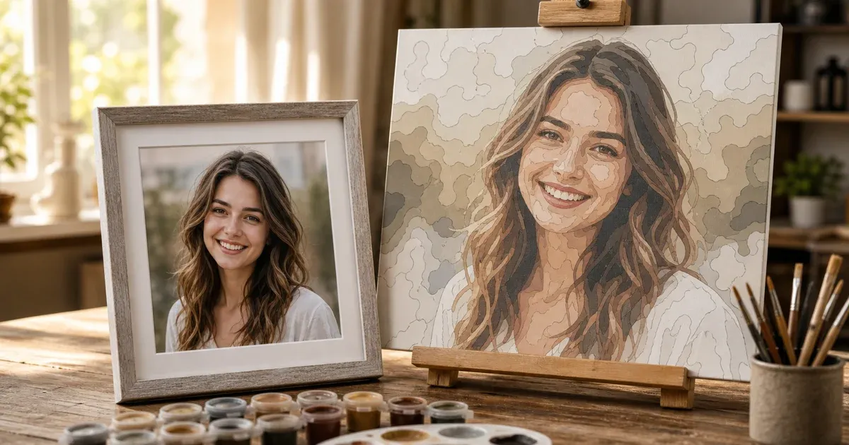
Why Portraits Are the Hardest Subject in Paint by Numbers
Landscapes, pets, and still lifes are forgiving. A tree can be three greens and still look like a tree; a sky can be two blues and still look like a sky. Faces are not forgiving. A human face is built from extremely subtle gradients — the transition from forehead to temple, the faint pink under the eyes, the slightly cooler tone along the jaw — and our brains are exceptionally good at noticing when those gradients go wrong. Get a landscape's color slightly off and nobody notices. Get a face's color slightly off and it looks "off" in a way that's hard to name but impossible to miss.
This guide is about closing that gap: what makes portrait source photos succeed or fail, how the underlying color math treats skin, and how to use a paint-by-numbers generator's newer detail-focus tools to keep faces from turning into a flat, waxy mess. You can follow along with our free Paint by Numbers Generator, which includes a "Faces" detail-focus mode built specifically for this problem.
Why Faces Break Down at Low Color Counts
Our guide on how many colors to use makes the case that fewer colors is usually better — and for most photos, that's true. Portraits are the exception, or at least the place where the rule needs the most nuance. Here's why.
A paint-by-numbers generator works by color quantization: it clusters every pixel's color into a fixed number of groups and replaces each pixel with its group's representative color (see our companion article on turning a photo into a paint-by-numbers canvas for the full pipeline). On a landscape, the clusters land on genuinely different colors — grass green, sky blue, trunk brown — so a low color count still looks correct.
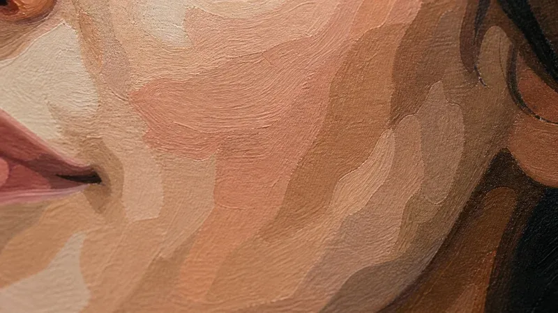
Skin doesn't work that way. A single face, under normal lighting, can span dozens of very close shades that are all "the same" skin tone to the eye. When you force those shades into just four or six clusters, the algorithm has to draw hard boundaries somewhere in the middle of a smooth gradient. The result is a face carved into a handful of flat, disconnected patches — a bright patch on the cheekbone, a darker patch under it, a harsh line where a shadow used to fade gradually. It reads as blotchy or waxy rather than as skin, because the eye is trained on real faces and instantly flags the missing gradation.
The Practical Consequence
- A color count that looks great on a landscape (say, 6–10) will usually look muddy or patchy on a portrait.
- Portraits generally need a moderate-to-higher color count than other subjects, specifically so there's enough palette budget to represent skin's subtle variation without stealing colors from the rest of the image.
- Because more colors means more, smaller regions, portraits benefit from being printed larger than a landscape of similar detail — otherwise the small skin-tone regions become too tiny to paint or number legibly.
Shooting a Source Photo That Gives the Algorithm a Fighting Chance
Before any software setting matters, the source photo does most of the work. A few habits make a disproportionate difference on faces specifically:
- Even, diffuse lighting. Harsh directional light (a single lamp, direct sun) creates strong shadows and blown highlights across the face. Those extremes eat up color budget that should be spent on the mid-tones that actually read as "skin." Overcast daylight or soft window light produces a much more even base to quantize.
- A plain, contrasting background. A busy or same-toned background competes with the face for the palette's limited colors, and it can confuse edge detection at the outline stage. A plain wall or simple backdrop keeps the algorithm's attention — and the painter's attention — on the face.
- Fill the frame. A face that's a small part of a large photo gets proportionally few pixels, and few pixels means the clustering step has less signal to work with when deciding how skin tones should split. A closer crop concentrates detail where it matters.
- Avoid heavy makeup contouring or strong color casts. Warm indoor lighting (tungsten bulbs) or a strong color-graded photo shifts the whole face toward orange or blue before quantization even starts, which can push skin tones into clusters that also catch background or clothing colors.
None of this requires a studio. A face near a window on an overcast day, photographed straight-on against a plain wall, will out-perform a dramatically lit photo from an expensive camera almost every time — because the quantization step benefits from consistency, not complexity.
Why the Color Space Matters: CIELAB and Skin Tones
The quality of a skin-tone result also depends on where the clustering math measures distance between colors, not just how many clusters it uses. Two skin tones that are numerically close in raw RGB values are not always perceived as close by a human eye — RGB is a display encoding, not a model of human color perception.
This is why the generator clusters colors in CIELAB color space rather than raw RGB. CIELAB was designed so that Euclidean distance between two colors approximates how different they look to a human observer — it is, as the source material is careful to note, only an approximation of perceptual uniformity, not a perfect one, but it is meaningfully closer to how we actually see than RGB is. In practice, this means the k-means clustering step is less likely to lump a warm, slightly pink cheek and a cooler, slightly yellow forehead into the same bucket just because their RGB numbers happen to be similar — it's comparing colors on a scale that's closer to how skin tones actually read to the eye. It's not magic, and it won't rescue a badly lit photo, but it does mean the clustering step is working with a more human-relevant sense of "close" and "different" when it decides how to split skin tones across the available palette.
The Quantization Tradeoff, Stated Plainly
Color quantization is, fundamentally, a tradeoff between fidelity and paintability: every color you don't include has to be approximated by the nearest color you did include. On a face, that tradeoff is felt more sharply than anywhere else in a photo, because faces are dense with fine, continuous variation and because human perception is finely tuned to detect exactly that kind of variation.
Two levers control how that tradeoff plays out:
- Total color count. More colors give the clustering step more places to put skin-tone distinctions — but only if those colors are actually allocated to the face rather than spread evenly across the whole image, including background and clothing that don't need the extra nuance.
- Where detail is concentrated. This is the harder problem, and it's the one a flat, whole-image color count can't solve by itself. A generic 16-color pass spreads its palette across the entire photo. If the background and clothing are visually simple, most of that budget is "wasted" on colors the eye barely needs — while the face, which needs it most, is still starved.
The Faces Detail-Focus Mode
This is exactly the gap the generator's Faces detail-focus mode is built to close. Instead of spreading color and region detail evenly across the whole photo, Faces mode concentrates more, smaller regions specifically on skin-tone zones, using a skin-tone weight map to identify where those zones likely are.
The weight map is built on a well-established idea in image analysis: skin tones cluster in a fairly predictable range when you look at color in terms of chrominance (the color information separated from brightness) rather than raw RGB. This chrominance-based approach to modeling skin color for detection is described in the classic computer-vision work on face detection in color images by Hsu, Abdel-Mottaleb, and Jain, published in IEEE Transactions on Pattern Analysis and Machine Intelligence in 2002 (see References below) — their method models skin color in the YCbCr chrominance space specifically because skin pixels, across a wide range of individual skin tones, tend to cluster tightly there even as overall brightness varies.
It's important to be precise about what this means in the tool: the skin-tone weight map is a heuristic, not face recognition. It doesn't identify "this is a face" the way a dedicated face-detection model would; it estimates, pixel by pixel, how likely a region is to be skin based on its color, and it uses that estimate to bias where extra region detail and palette budget go. On a typical portrait — a face and some hands or arms against a simpler background — that's enough to noticeably improve how skin gradients render, because it stops the algorithm from "spending" detail on a plain backdrop that didn't need it. It won't rescue a photo where lighting or framing already worked against you, and it isn't guaranteed to isolate a face perfectly in every image (a warm wooden background, for instance, can share some of the same chrominance range as skin). Think of it as tilting the odds in the face's favor, not as a guarantee.
How to Use It
- Upload a portrait and select the Faces detail-focus option before generating.
- Use a moderate-to-higher color count than you would for a landscape — the extra colors matter more here because Faces mode is actively directing them toward skin.
- Compare the result against the default (even) detail mode using the before/after slider. The difference is usually most visible in the smoothness of cheek and forehead shading.
- If skin still looks blotchy, try a slightly higher color count before assuming the photo itself is unusable — the two levers (color count and detail focus) compound.
A Simple Workflow for Portraits
- Start with a photo shot in even, diffuse light against a plain background, cropped fairly close to the face.
- Upload it to the Paint by Numbers Generator and select the Faces detail-focus mode.
- Start at a moderate-to-higher color count than you'd use for a landscape, and compare it against a slightly higher and slightly lower value.
- Check the numbered black-and-white view to confirm the skin-tone regions are still large enough to paint — if they're too small, either raise the print size or reduce the color count slightly.
- Plan to print larger than you would for a same-size non-portrait subject, since portraits carry more, smaller regions by necessity.
Common Mistakes with Portrait Templates
- Using the same color count as a landscape. A count that looked great on a sunset will almost always look patchy on a face — portraits need more headroom.
- Skipping the plain background. A busy background steals palette budget that should go to skin, even with Faces mode helping steer detail.
- Printing too small. The smaller, more numerous regions a good portrait needs will become unpaintable at postcard size. Go bigger than you think you need.
- Expecting perfect face isolation. The skin-tone weight map is a heuristic based on color, not a face-recognition system. It biases detail toward likely skin zones; it doesn't guarantee a flawless boundary around the face.
- Harsh single-source lighting. Deep shadows and blown highlights use up color budget on extremes rather than the mid-tones that make skin look like skin.
Conclusion
Faces are the one subject where the usual paint-by-numbers advice — fewer colors, keep it simple — needs an asterisk. Skin's continuous, subtle gradients need more palette room than a landscape or still life, a color space that approximates how the eye actually judges color similarity, and, ideally, detail steered specifically toward the zones that need it most. Shoot in even light against a plain background, lean on a moderate-to-higher color count, and let the Faces detail-focus mode concentrate the extra detail where it counts. None of it is magic — it's a set of levers that compound — but used together they turn a flat, waxy portrait into one that actually reads as a face. Try it with the free Paint by Numbers Generator and compare the Faces mode against the default on your own portrait.
References and Further Reading
- Face Detection in Color Images — Hsu, Abdel-Mottaleb, and Jain's classic work modeling skin color in the YCbCr chrominance space, the basis for the chrominance-based skin-tone heuristic behind the Faces detail-focus mode.
- CIELAB color space — the perceptual color space used for clustering, designed to approximate perceived color difference (though not perfectly perceptually uniform), which matters for how skin-tone distinctions are drawn.
- k-means clustering — the clustering algorithm that groups skin-tone pixels into the palette's available colors.
- Color quantization — background on the fidelity-versus-paintability tradeoff at the core of why faces need more careful handling than other subjects.